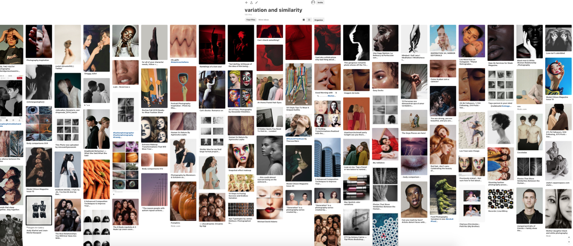
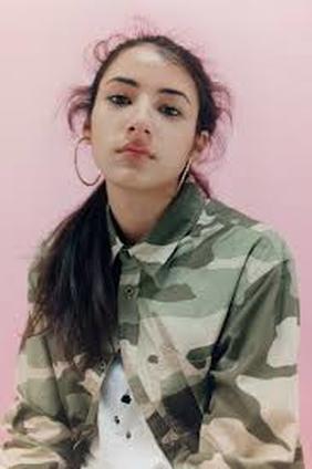
Variations and Similarities within the City
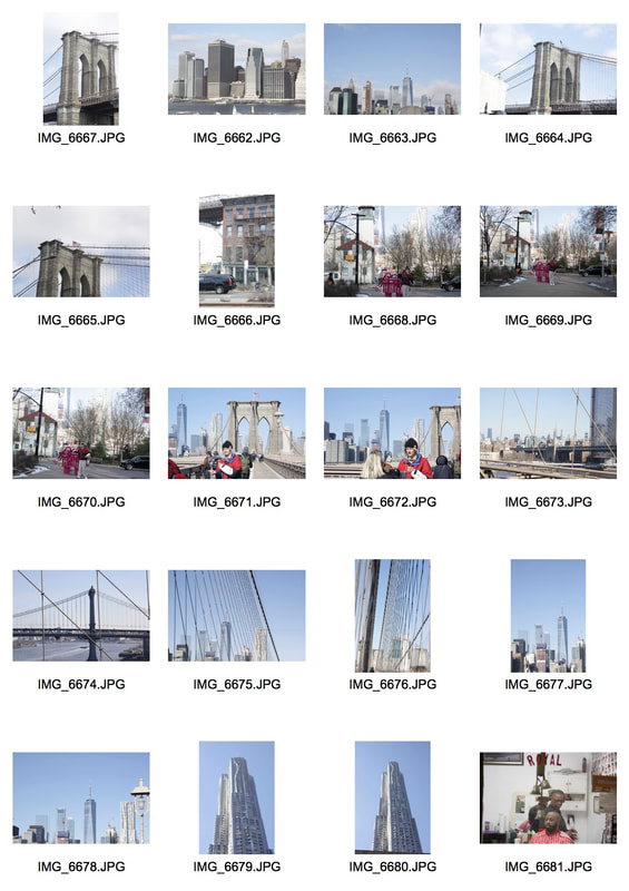
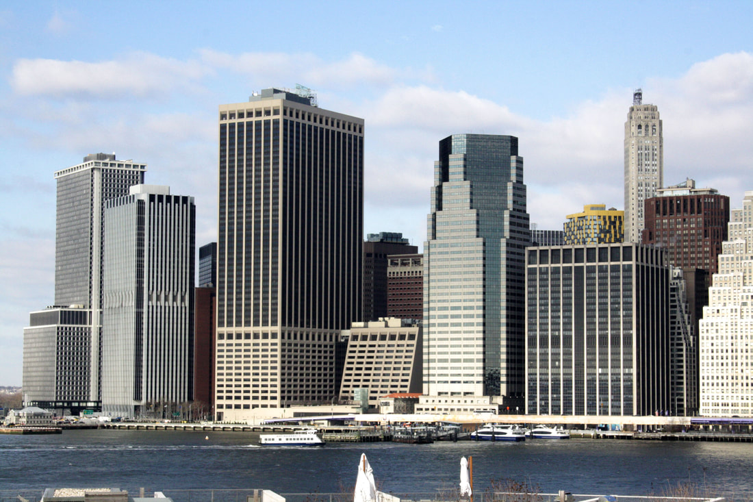
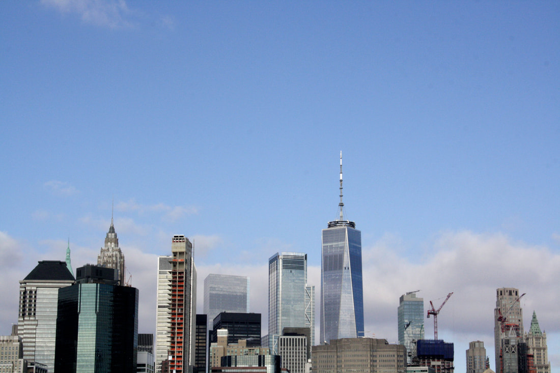
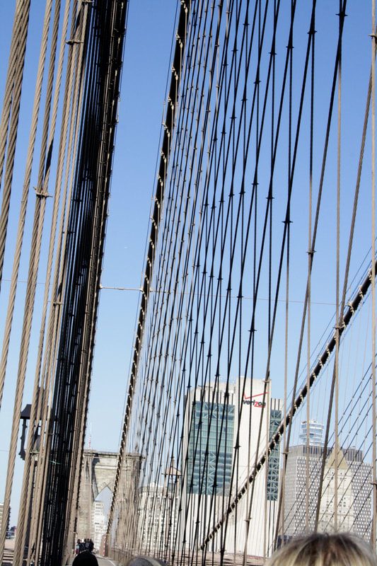
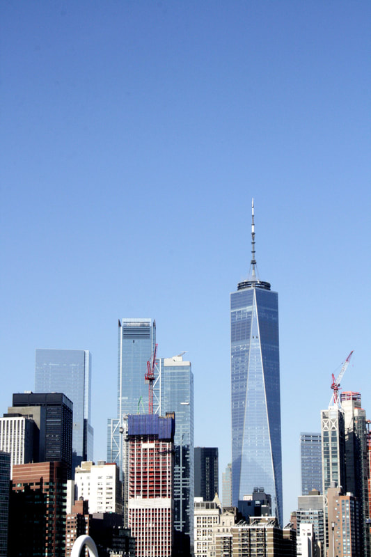
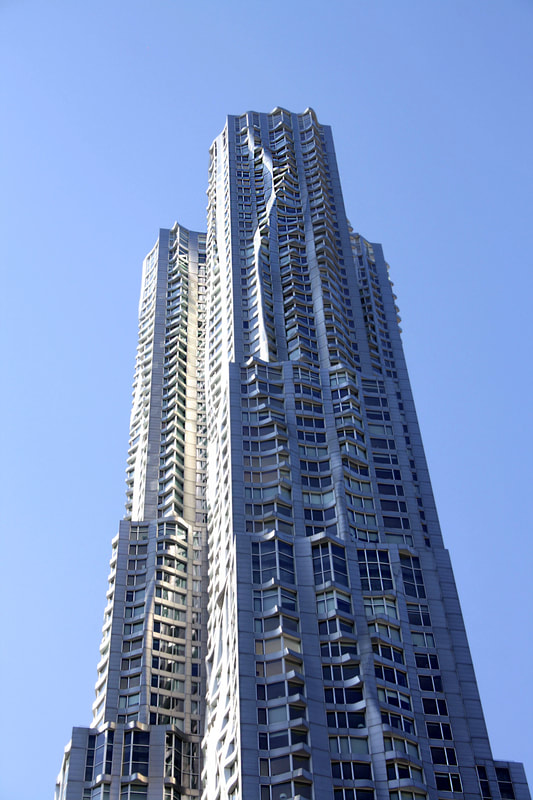
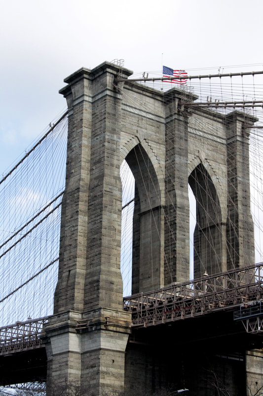
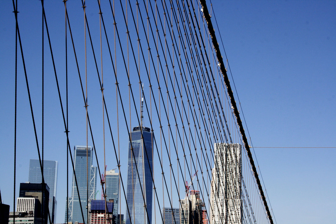
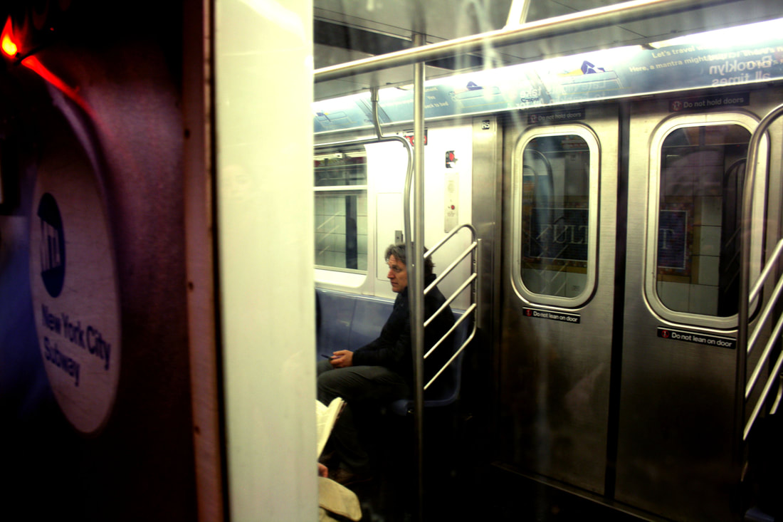
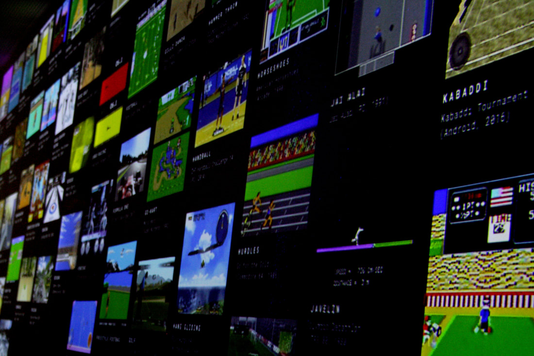
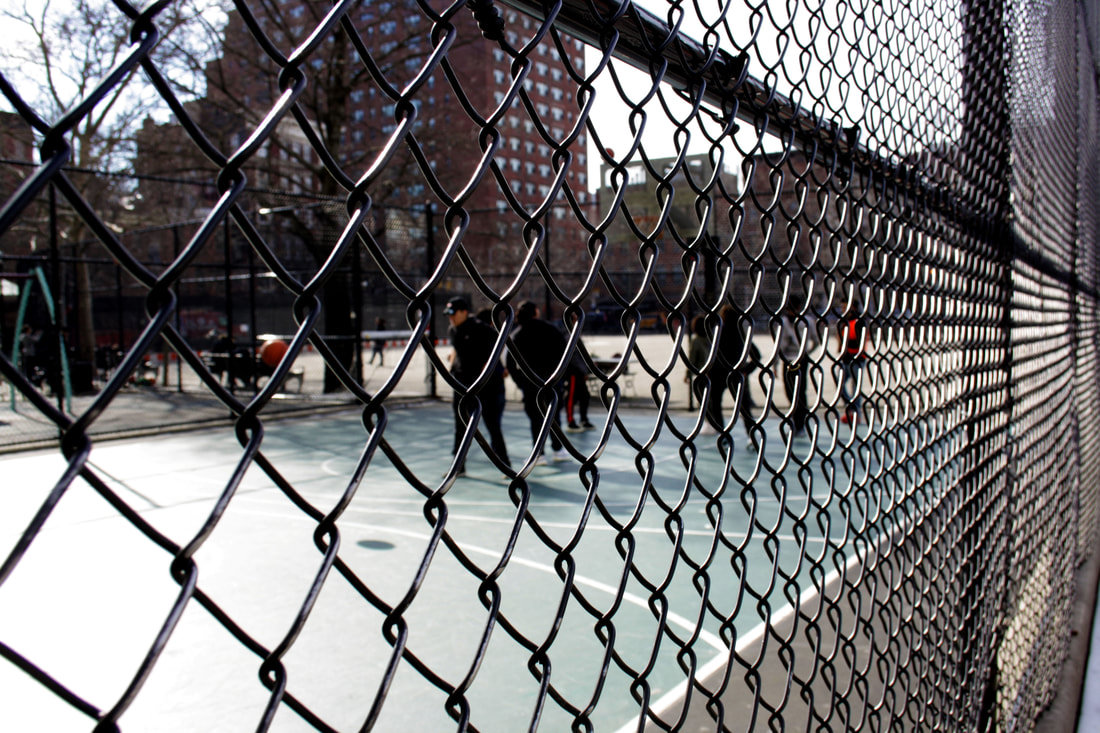
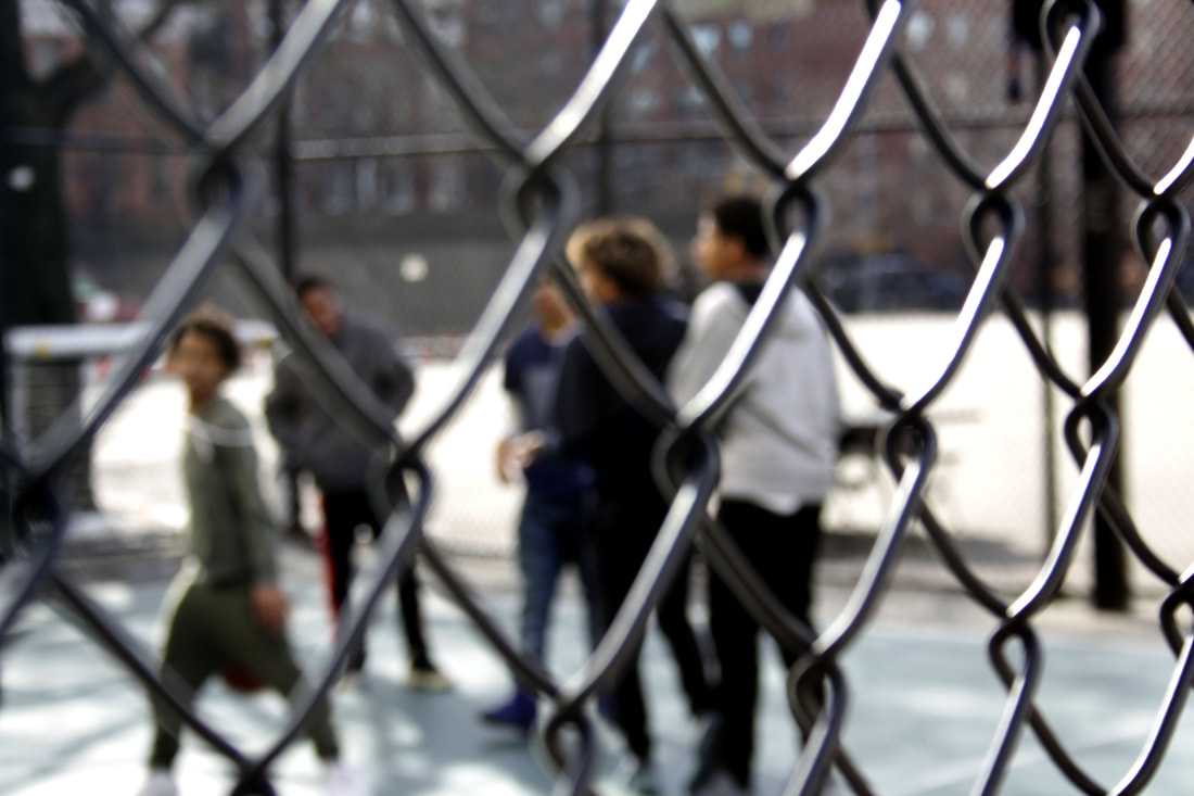
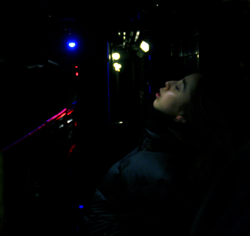
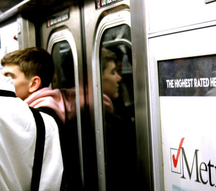
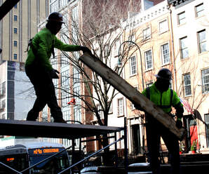
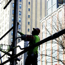
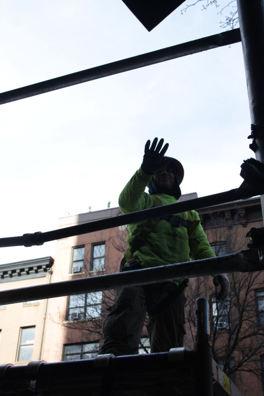
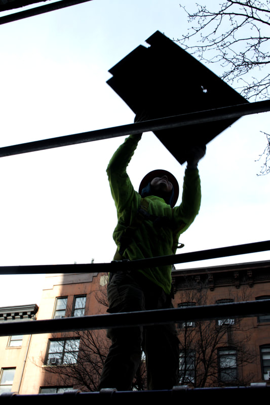
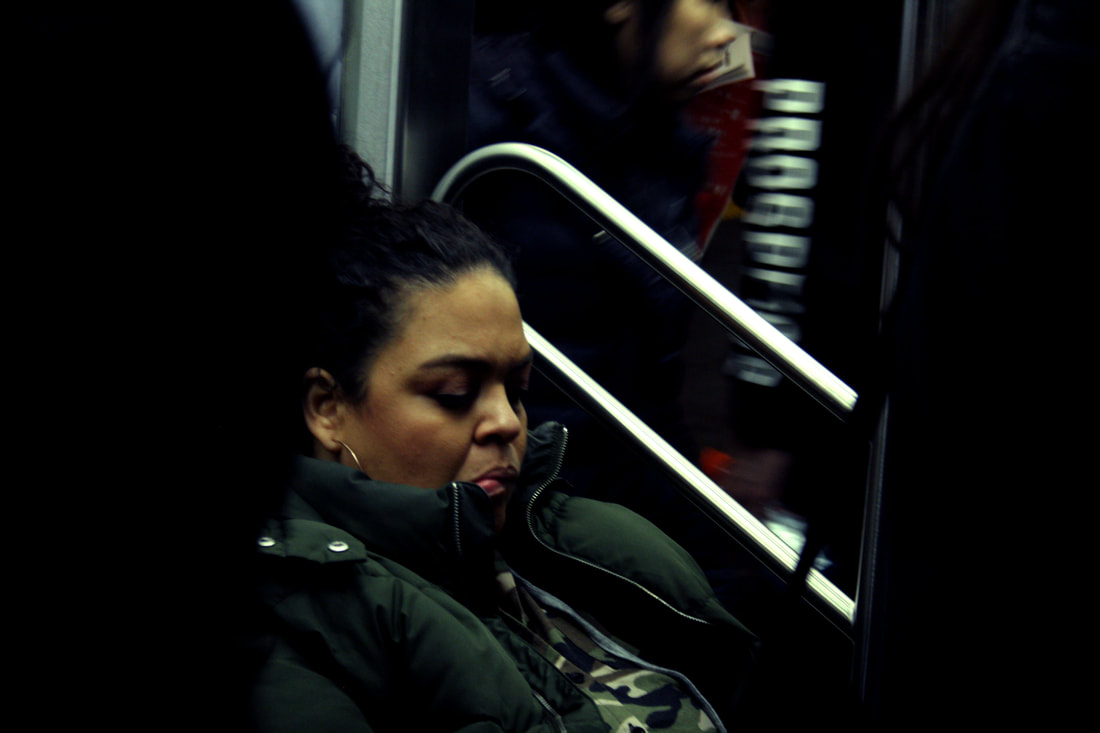
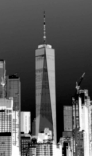
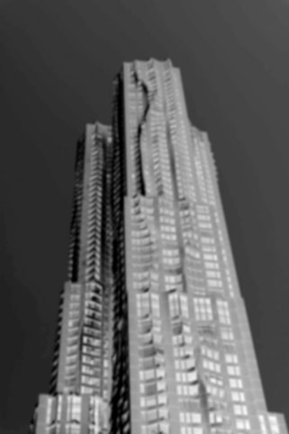
On a recent school trip to New York we were looking at similarities and differences within the city. This varied between building structure, the different people, the culture and atmosphere ect. To get started we had to photograph the city in different ways with the aim of producing different variations of photographic processes. We needed to look for ways in which the locations are similar but at the same time are different.
|
|
|
|
|
|
Selects:
|
|
|
|
|
|
|
|
|
|
|
|
|
|
|
|
|
|
|
|
|
|
|
|
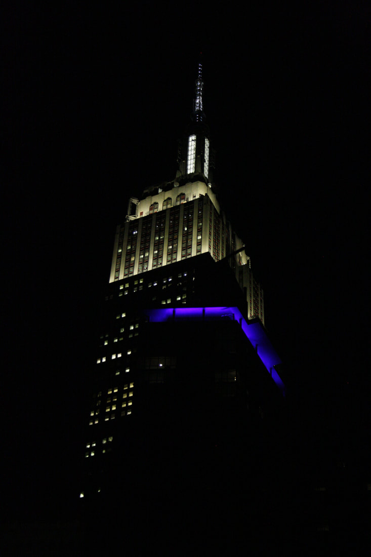
From photographing the city I concluded that although the infrastructure is similar, in the sense that the buildings are all built up vertically, all the sky scrapers and other buildings have different characteristics such as material, decor, windows, aesthetic and none are exactly the same despite having the same obvious style. I also noticed a great diversity of people and different ethnicities of people who live in the city.
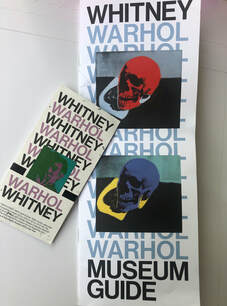
Exhibition visit- Andy Warhol
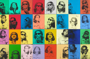
Whist on the school photography trip to New York I visited a selection of museums and exhibitions. The Andy Warhol exhibition at the Whitney museum struck me the most with Warhol's contradictory and complex Art. The exhibition-Includes works from his collection- From A to B and back again, the first major exhibition of his work organised by an American museum in thirty years. The Gallery presented a wide selection of experimental works Warhol produced from the 1960s to the 1980s, including his innovative output in film, video and screen printing. Andy Warhol was fast in incorporating new technologies and approaches of distribution into his art and he produced a variety of moving images- from short adverts to diary-like videos of his studio activities to full length T.V. series. Below are some of the works from the exhibition which particularly interested me.
|
|
|
|
|

|
From A to B and back again is the largest to date US retrospective of the artists work. With over 350 works of art across all media and the first comprehensive presentation of his work in New York since 1989, shortly after his death. Beginning with his 1950s work as a commercial illustrator and charting every stage of his art making, the exhibition gave a holistic view of Warhol's 4 decade artistic career and a remembrance of his less known late work; Which i found to have a particular focus on his sensitivity to the reception of images.
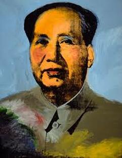
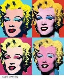
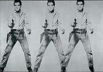
I found that the Andy Warhol exhibition was particularly relevant when exploring the theme 'variations and similarities' due to the fact that he is a well known artist that explores popular culture, mass media, repetition and screen printing techniques. As seen in some of the pieces above such as his typologies, many of his images showcase the use of repetition, his series' such as 'tripple Elvis' and his Marilyn Monroe series also show repetition as well as exploring his screen printing techniques.
I found that the Andy Warhol exhibition was particularly relevant when exploring the theme 'variations and similarities' due to the fact that he is a well known artist that explores popular culture, mass media, repetition and screen printing techniques. As seen in some of the pieces above such as his typologies, many of his images showcase the use of repetition, his series' such as 'tripple Elvis' and his Marilyn Monroe series also show repetition as well as exploring his screen printing techniques.
Exhibition visit- Don McCullin |
|
South Vietnam, 1968
|
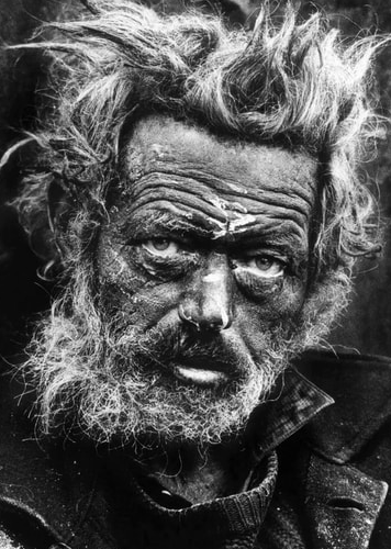
Homeless Irishman, Spitalfields, London, 1969
|
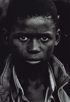
A Boy at the Funeral of his Father, Zambia, 2000
|
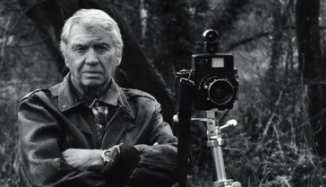
I also visited an exhibition in London: the Don McCullin exhibition at the Tate Britain. The exhibition showcased some of McCullin's most influential items from his documentary work. His work is very much focused on different societies, races, countries. This is evident in his Berlin series in which he photographed soldiers in 'Near Checkpoint Charlie' during the conflict between East and West Berlin in 1961. The exhibition included many of his iconic war photographs such as images from; Vietnam, Northern Ireland and more recently Syria. But it also focused on the work he did at home in England, recording scenes of of poverty and working class life.
Don McCullin was born in 1935 and grew up in a deprived area of north London which is reflected in much of his works. He was properly noticed when a newspaper published his photograph of friends who were in a local gang. From the 1960s, many would say, he has created a career as the UK’s foremost war photographer, working for companies such as the Sunday times. His unforgettable but sometimes disturbing and heartbreaking images are accompanied in the exhibition with his brutally honest commentaries.
McCullin had a significant contrast from his previous documentarian work he did to later projects such as 'Flowers and Fruits' (1980) and 'Somerset' (2008) which were focused around still life and landscapes. McCullin justified this change to photographing nature and more positive subjects when he stated: 'I'm going to spend the rest of my life trying to eradicate the things I have seen- I'm going to photograph the landscape- the English landscape is my form of heaven'. Furthermore, all of his photos are captured in monochrome which additionally adds vulnerability to his images. McCullin's work now reflects a variety of landscapes, emotions and ideas in which the viewers are able to identify the similarities and differences.
First task- Typology series
Boris Mikhailov
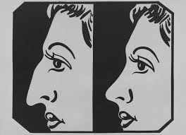
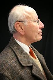
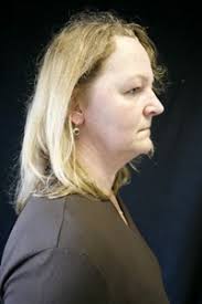
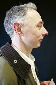
Mikhailov is a photographer who created Portraits Nearly a century after August Sander's portraits of German society, the Ukrainian photographer Boris Mikhailov created a series of photographs of the amateur actors in a German theatre company in the town of Braunschweig. The pictures are shot in profile against a black background. Mikhailov makes reference to Sander's typological study and to Theodor Piderit's Principles of Mimic and Physiognomy which was published in Braunschweig in 1858 and also to Hitler's interest in eugenics; Hitler became a German citizen in Braunschweig in 1932.
The profile portrait encourages the viewer to make formal comparisons between the sitters. Mikhailov's portraits and those of August Sander were exhibited together 2012.
|
|
|
|
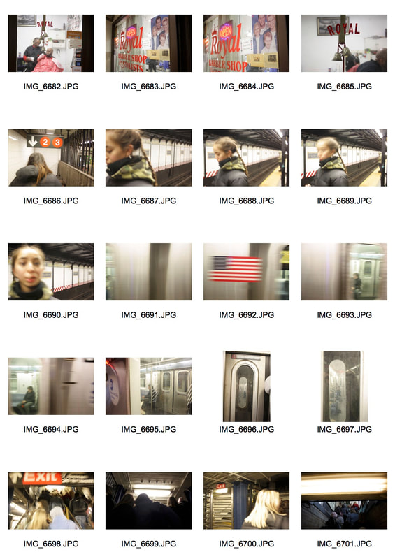
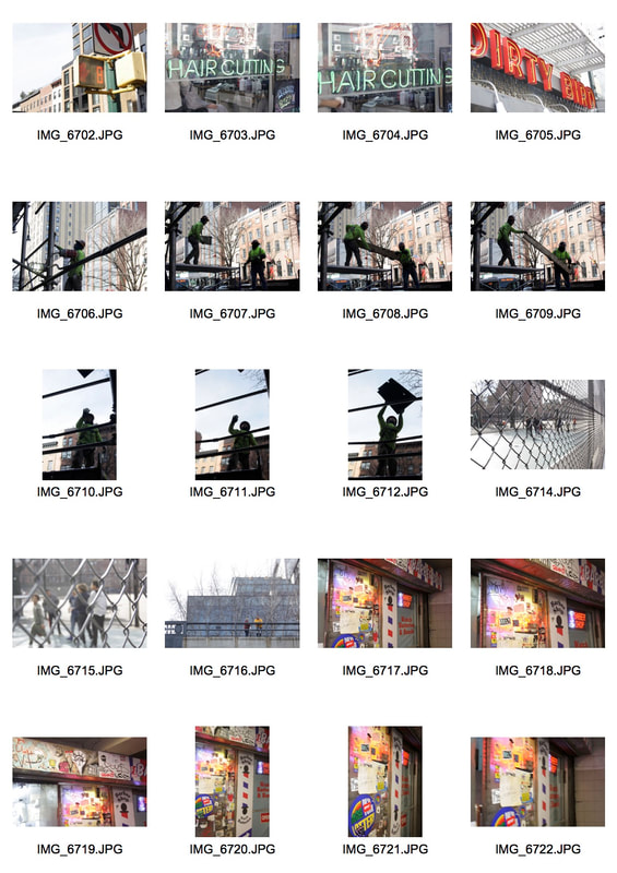
In This task we had to create our own typology series documenting repeated forms. As we were in New York for a trip I thought it would be interesting to take photos of shop fronts and signs such as barbers and restaurants because they are mostly bright and bold. This links to the subject matter of 'similarity and variation' as photographing the same things and displaying them in a series highlights the differences between them. Some of the photos I took were at night and others in the day so all the shop fronts look different and as most of them were made with lights the photos taken at night were most successful.


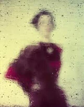
Variations and similarity in Focus
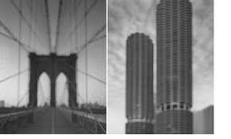
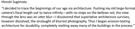
Hiroshi Sugimoto is a idealistic and intense photographer based in New York and Tokyo. All of his series have a distinct theme and similar attributes. Mainly using an 8x10 large format camera, Hiroshi Sugimotos specialises in a type of photography called "slow shutter speed" photography. He refers to his signature photographic style as "time exposure" experiments where he plays with shutter speeds. His goal through these "experiments" is to capture time through his images - creating time capsules that will last for eternity.
|
|
My Response
For this task we had to consider the effect of a photo that isn't in focus. Considering if it suggests something else other than the subject being photographed, does the variation in focus take away the similarities of a location or add to it. Looking at the work of Hiroshi Sugimoto I created some photographs in the style of him using photoshop and some using the focus on my camera and my understanding of depth of field to experiment with focus.
Select:
|
Edit: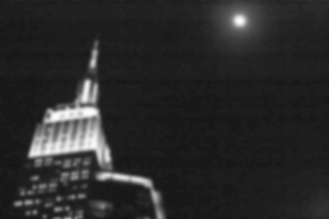
|
|
|
|
|

|
|
|
|
|
|
The photographs above were altered on photoshop to look blurry in the style of Hiroshi Sugimoto. I experimented with these by using tools such as inverting the colours, changing into black and white and using a blur filter. However, I also wanted to experiment with my shutter speed and try and take some long exposure photographs where there is a sense of movement. Therefore below are some pictures that I took with moving objects. I thought the photographs with a subject infront of the moving background were successful with the focus on the subject and then the moving train behind. During this task I examined whether an image can become too burred to the point where it is unrecognisable and I came to a conclusion that my most successful images where the ones where you could identify what the photograph was of.

|

|

|

|

|

|
Variations and similarities in landscapes
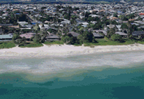
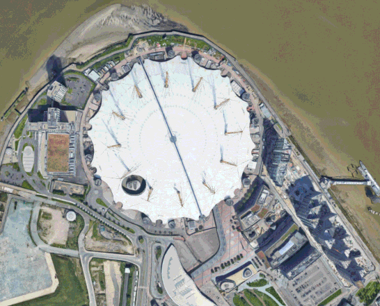
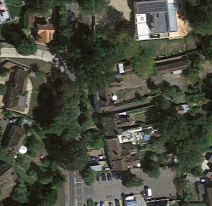
In the short film, EPOCH, by Irish director and animator Kevin McGloughlin, aerial images of the Earth are pieced together to compare the structural similarities of various suburbs, highways, and fields. When flashed one after the next, buildings and roads form different shapes. The film bears many similarities in form and editing to his brother and collaborator Paraic McGloughlin's short film, Arena, which also utilizes Google Earth-sourced images to created fast-paced animated sequences.
For this task we had to consider different areas in the world that have meaning to us- such as places where we have been. And we had to consider the variations and similarities that these different locations have.
Using Google Earth I took screen shots of specific locations photographed from above and then in photoshop made a selection of giffs in the style of the McGloughlin brothers. In the process of making my giffs I wanted to consider how dense urban environments may look in comparison to vast unpopulated areas. I then placed the giffs alongside each other so they can be compared and viewed at the same time. I also took into account the angles and varied how close up my screen shots were.
Using Google Earth I took screen shots of specific locations photographed from above and then in photoshop made a selection of giffs in the style of the McGloughlin brothers. In the process of making my giffs I wanted to consider how dense urban environments may look in comparison to vast unpopulated areas. I then placed the giffs alongside each other so they can be compared and viewed at the same time. I also took into account the angles and varied how close up my screen shots were.
|
|
|
Variations in layout and part
Noémie Goudal’s practice is an investigation into photographs and films as dialectical images, wherein close proximities of truth and fiction, real and imagined offer new perspectives into the photographic canvas. The artist questions the potential of the image as a whole and looks at variation of meaning, by reconstructing its layers and possibilities of extension, through landscapes’ installations. In her Soulevement series, she creates images of rock formations which turn out to be photographs of sets of mirrors installed in the landscape.
For this task we had to use the work of Goudals as inspiration and look for interesting landscapes in the school and take a series of photographs that depict the landscapes in different points of views. Focusing on capturing both Variety and similarity in the photographs.
For this task we had to use the work of Goudals as inspiration and look for interesting landscapes in the school and take a series of photographs that depict the landscapes in different points of views. Focusing on capturing both Variety and similarity in the photographs.
|
|
|
|
|
|
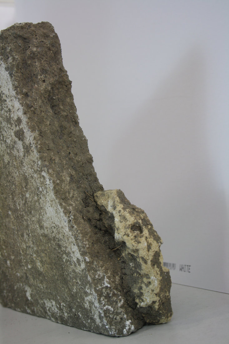
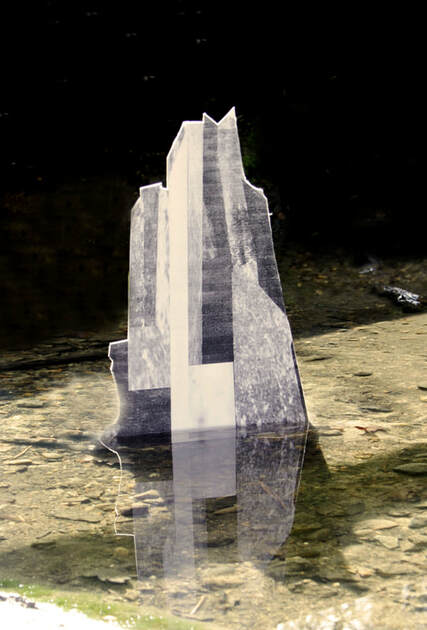
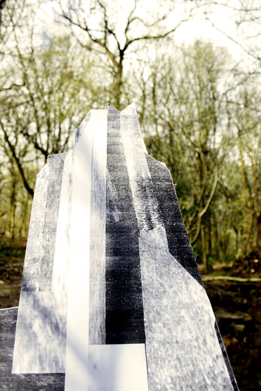
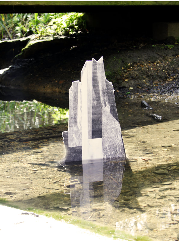
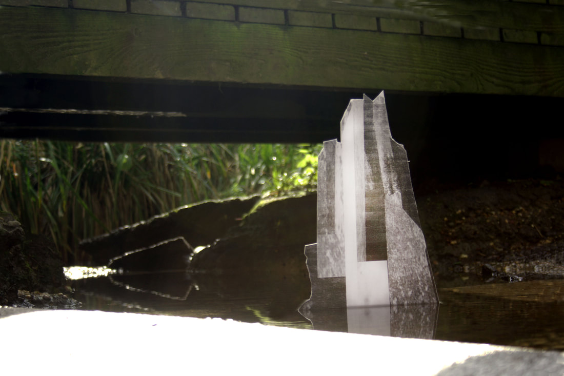
After taking pictures around the school I used photoshop to make a template of a building from sections of the different pictures I took. I used a photo of a skyscraper I took in New York as a template and created the image below on the right in photoshop by skewing section of my photographs to fit into the shapes of the building. I think this would have been more successful if I used a brutalist building for my template as brutalist structures are often smooth concrete buildings which would have been simpler to replicate. However i wanted to use one of my own photographs and I think the end results were successful.

|
|
|
|
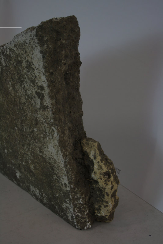
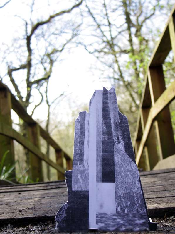
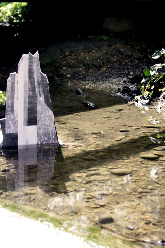
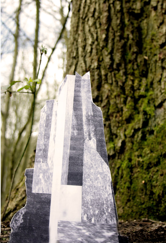
After creating my building I mounted it so it could stand up on it's own and our class went to Coldfall woods to photograph our buildings in situ. I took the images at a low camera angle to create a photograph that made the building look as if it was emerging from it's surroundings. I feel the most effective images were when the base of the building was inline with the bottom of the photograph as it seemed more realistic. I think that my most successful photograph is the first one below on the left. I think putting it in the water where there were no trees in the shot gave it more of an illusion of a real building as the location looked more realistic. I think the reflection in the water also gives the photograph a nice aesthetic.
|
|
|
|
|
|
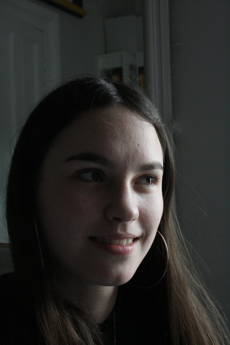
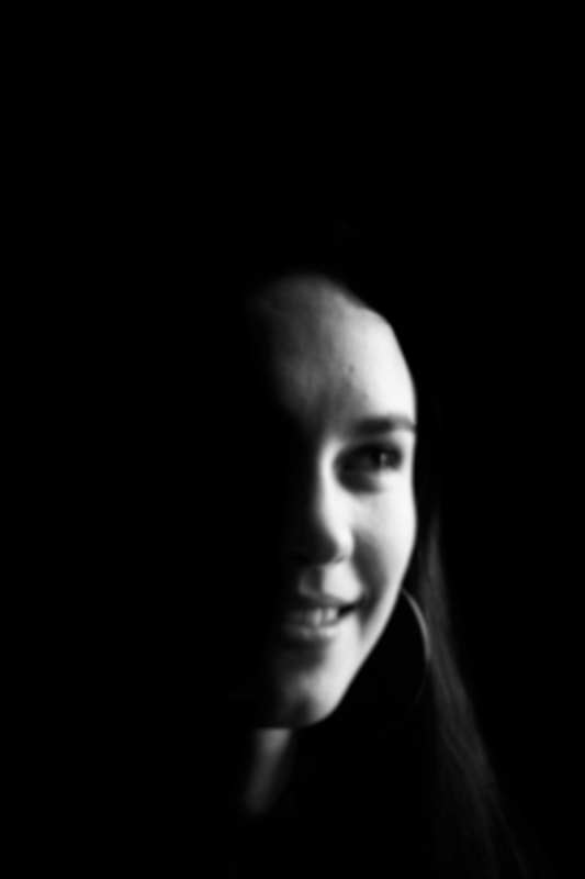
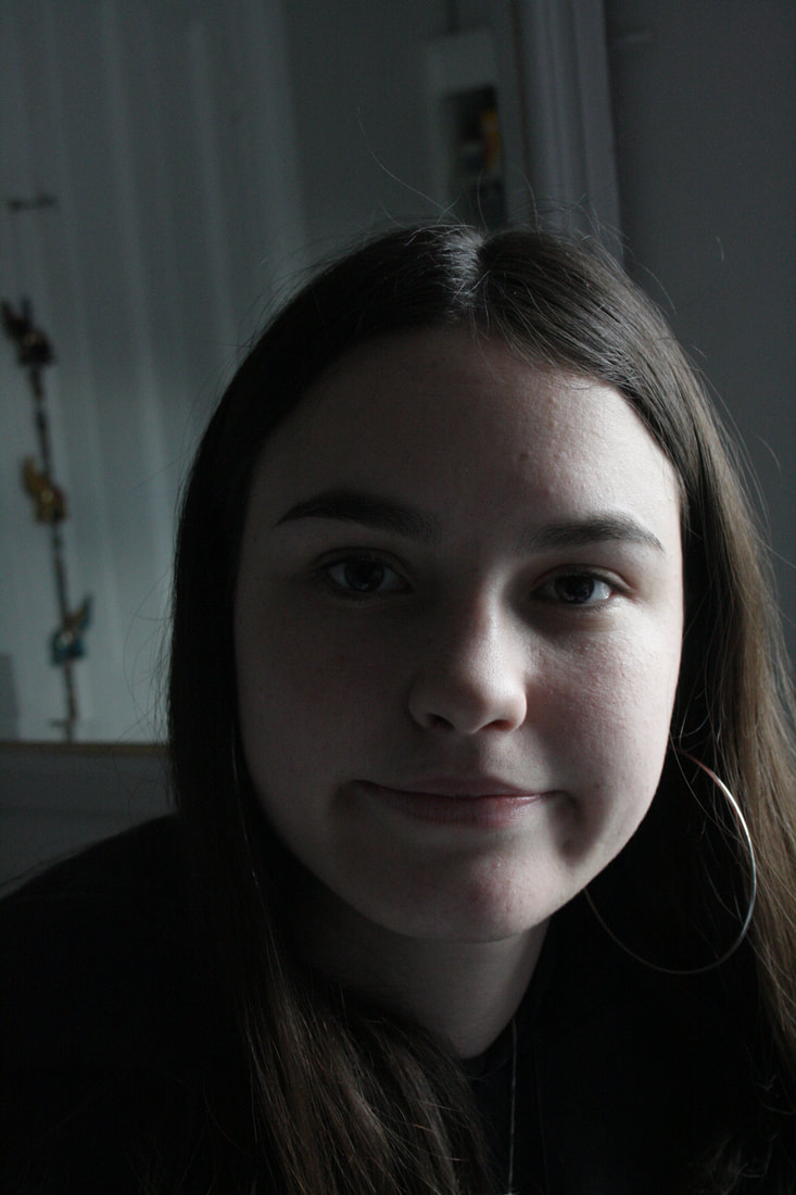
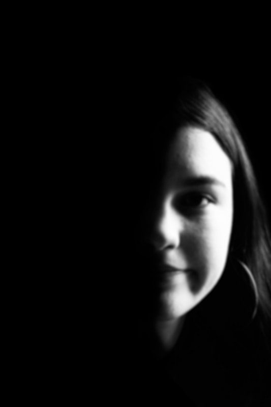
Shadow and light portrait variation
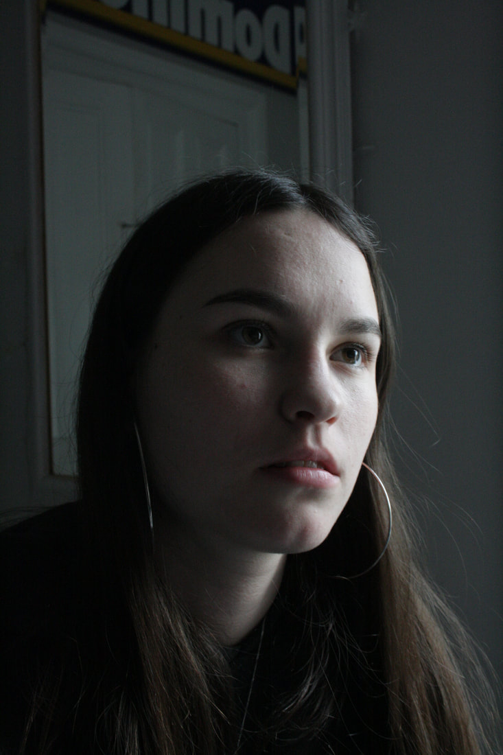
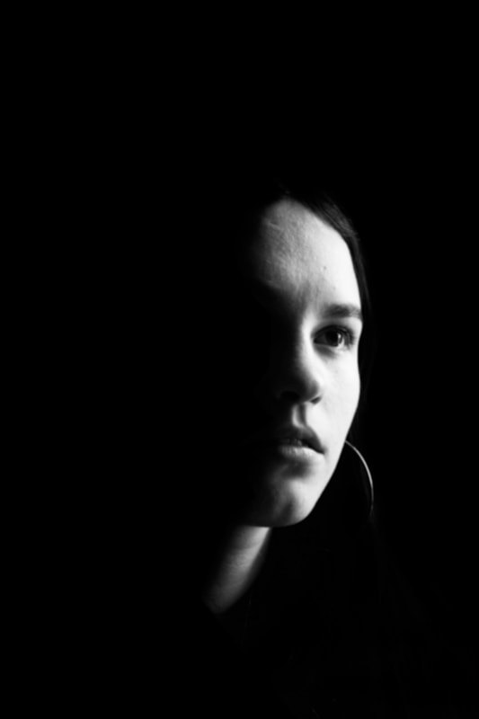
Valerie Kabis
For this task we experimented with lighting and focus. We used the work of Valerie Kabis as inspiration. Kabis Is interested in where shape is created by the restriction of light. Experimenting with light and shadow and experimenting with variations in lighting Kabis creates a series of dark and thought provoking images. The images I took are both hidden yet seen, almost as if I have selected which part of the picture I want the viewer to see . I think that if I made the photos slightly more abstract and blurry on photoshop it would have been more interesting and in the style of Kabis. However i was pleased with the overall aesthetic of the images and think that the exposure of certain elements of the photograph leaves more room for interpretation for the viewer.
|
|
|
|
|
|
3 strands
First strand: Variation in skin colour.
For my first strand I intend to examine variations in skin colour by creating a typology. I'm going to take portraits of a variety of people and then make the background colour match their skin. Ill do this using photoshop and then put them in a series creating a typology of all the different people and skin colours. This task links to the Title of variations and similarities as it looking at the variations in ethnicity and colour whilst all the subjects being photographed are people which is the similarity between them.
For the images below I highlighted the parts of the body that I wanted as the foreground using the quick selection tool on photoshop and then copied that section. Then for the colour of the background I chose the colour by taking a sample from the subjects skin colour. i then painted the photograph with the selected colour. I then pasted the copied foreground image and merged the two layers together> layer> flatten image. i then used the paint brush tool to fill in any missed sections and smooth the edges of the portrait. once the background was a solid colour i then saved the image.
For the images below I highlighted the parts of the body that I wanted as the foreground using the quick selection tool on photoshop and then copied that section. Then for the colour of the background I chose the colour by taking a sample from the subjects skin colour. i then painted the photograph with the selected colour. I then pasted the copied foreground image and merged the two layers together> layer> flatten image. i then used the paint brush tool to fill in any missed sections and smooth the edges of the portrait. once the background was a solid colour i then saved the image.


WWW- I managed to get a few different people to photograph in order to create the typology and managed to match the bavkground to their skin colour.
EBI- I took photos of more people who have different skin tones as there was not much variation. And also if I blended to edges of the person into the background more as they look ridged and hash.
EBI- I took photos of more people who have different skin tones as there was not much variation. And also if I blended to edges of the person into the background more as they look ridged and hash.
Strand 2: Linked by common interest
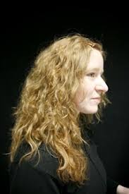
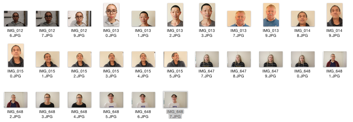
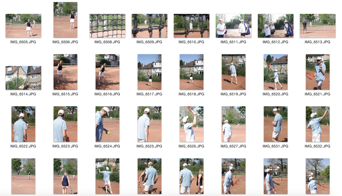
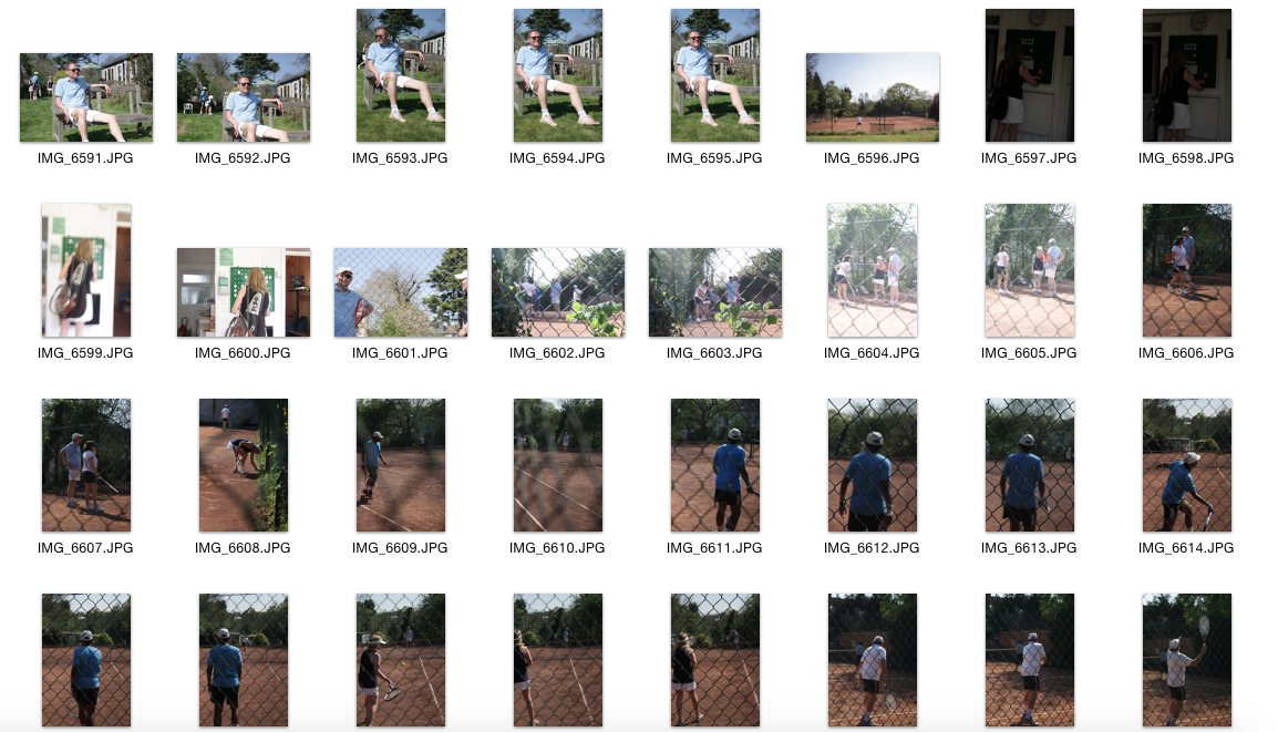
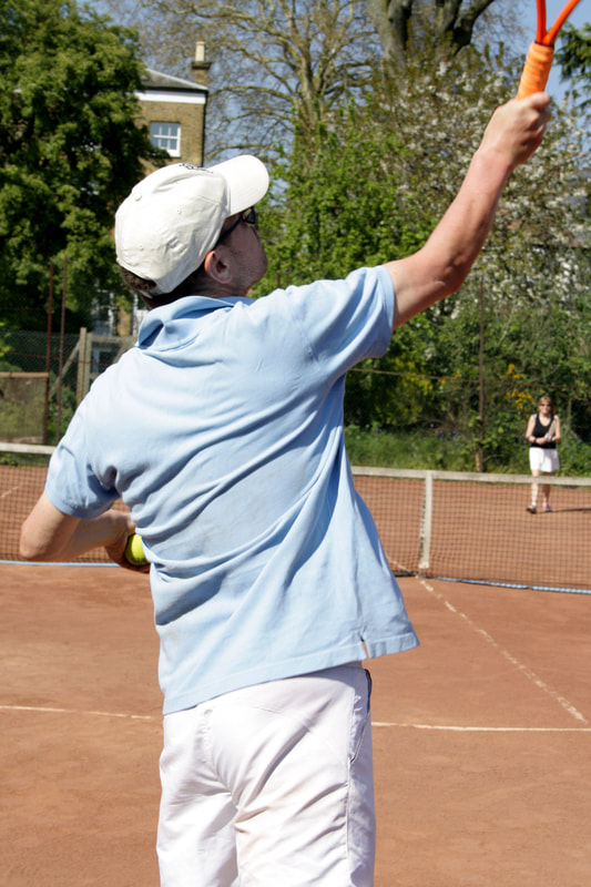
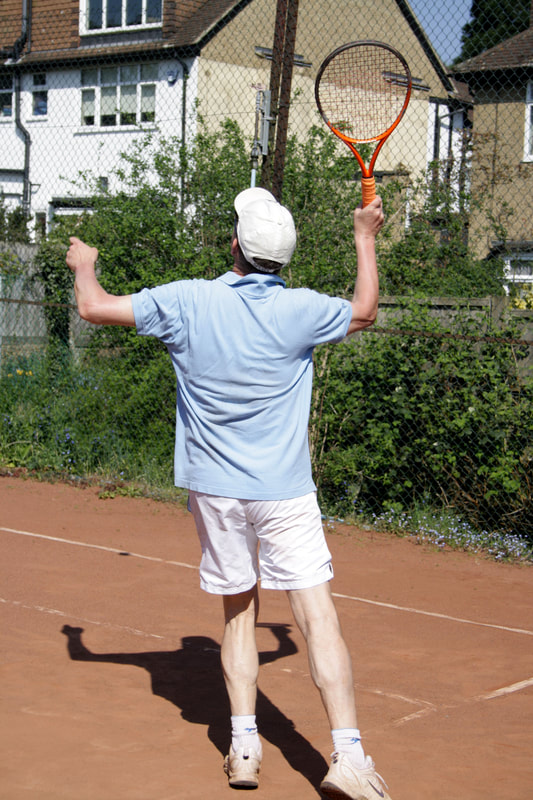
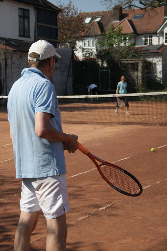
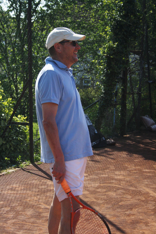
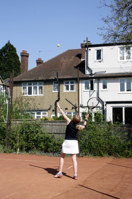
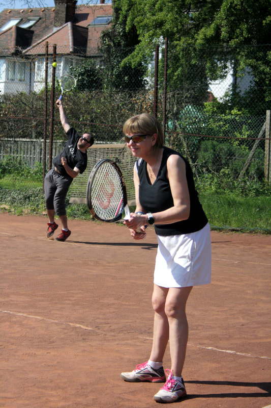
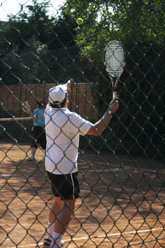
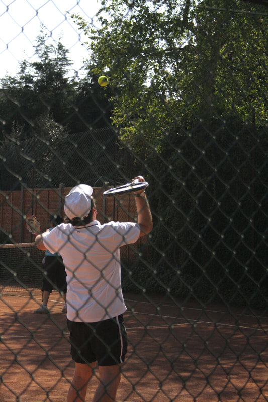
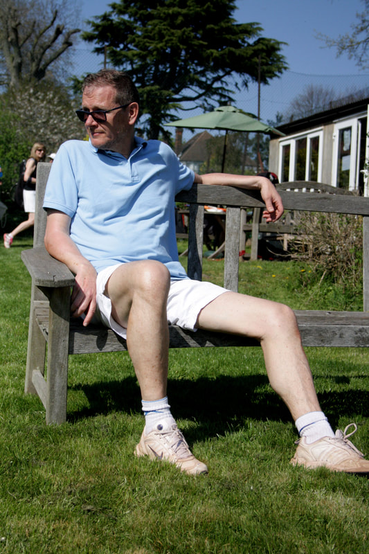
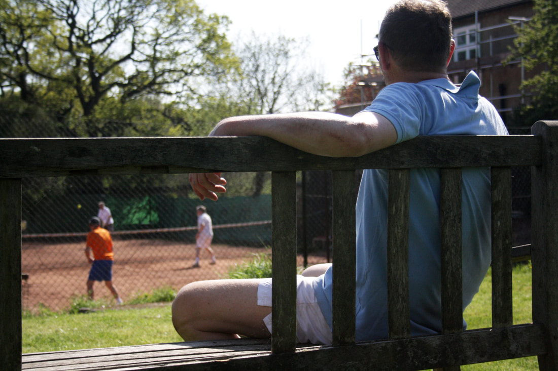
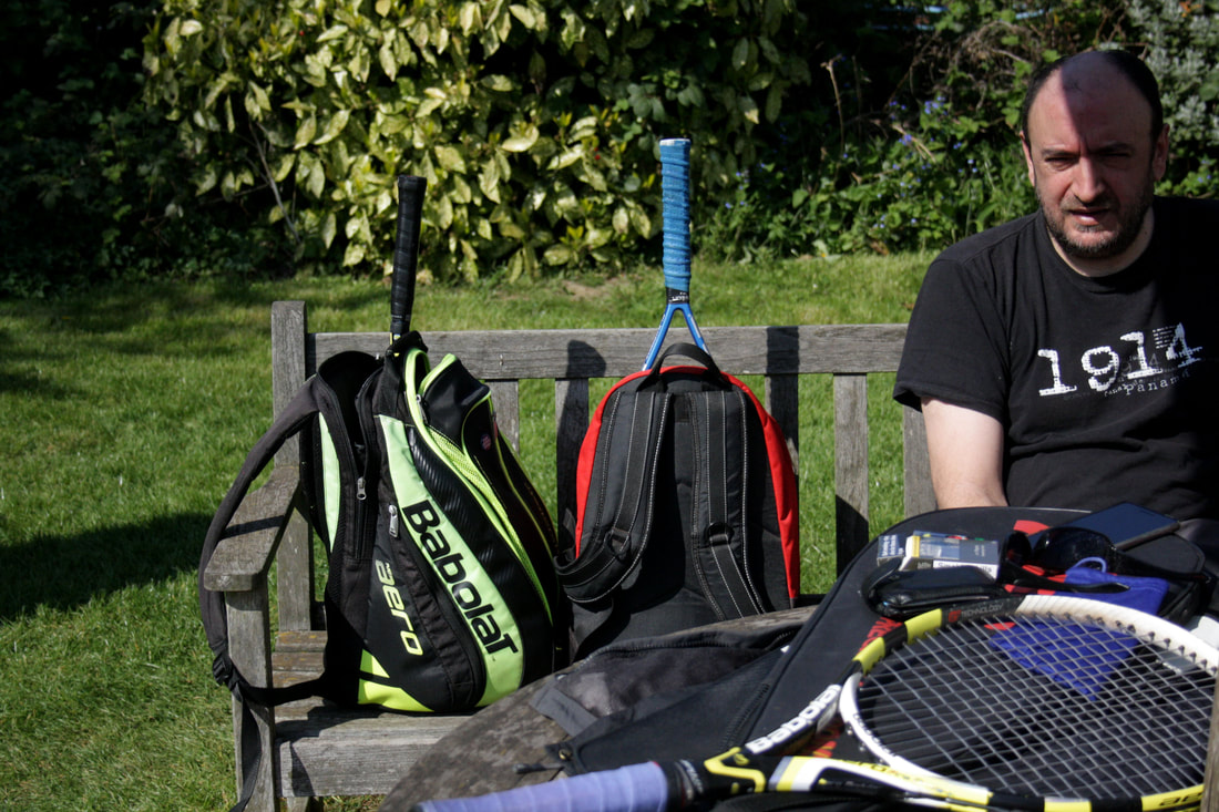
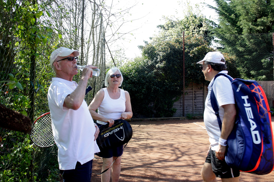
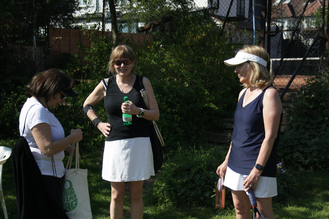
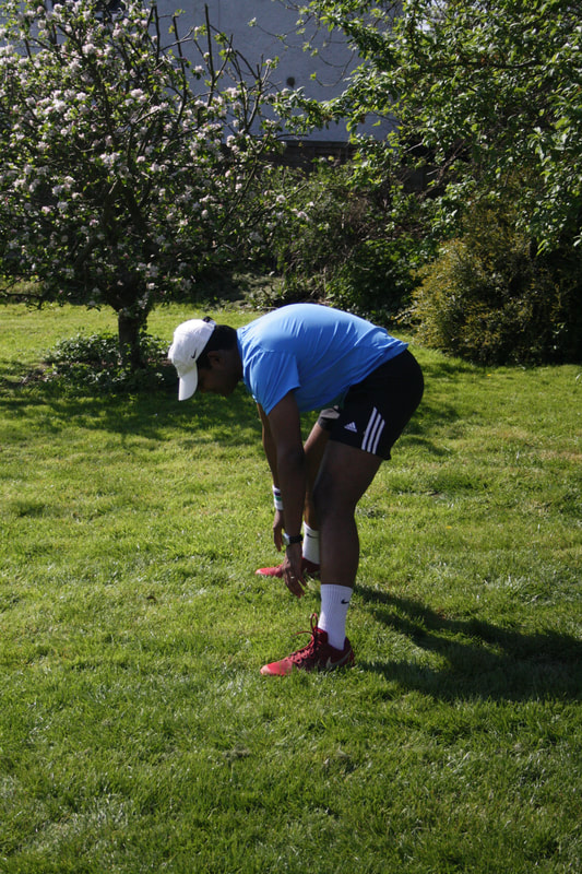
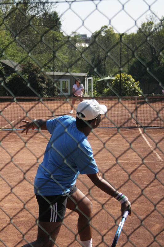
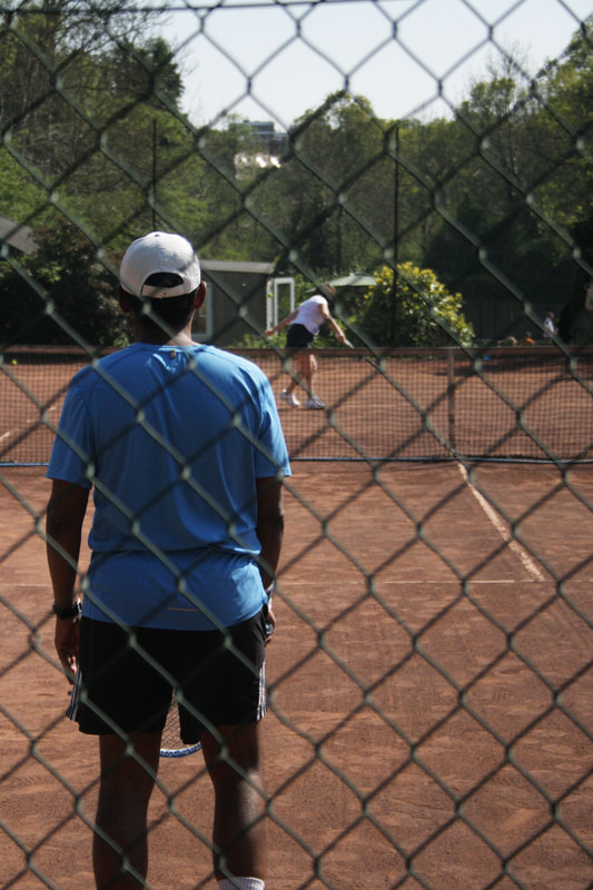
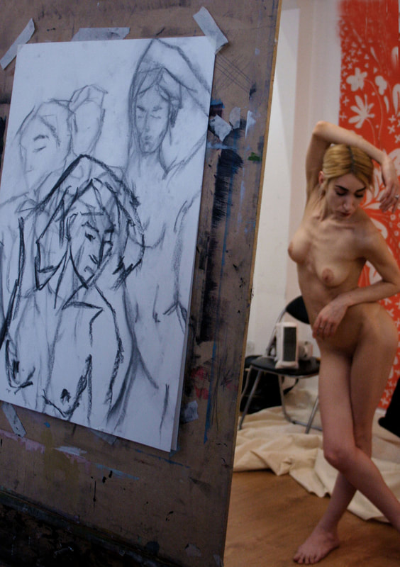
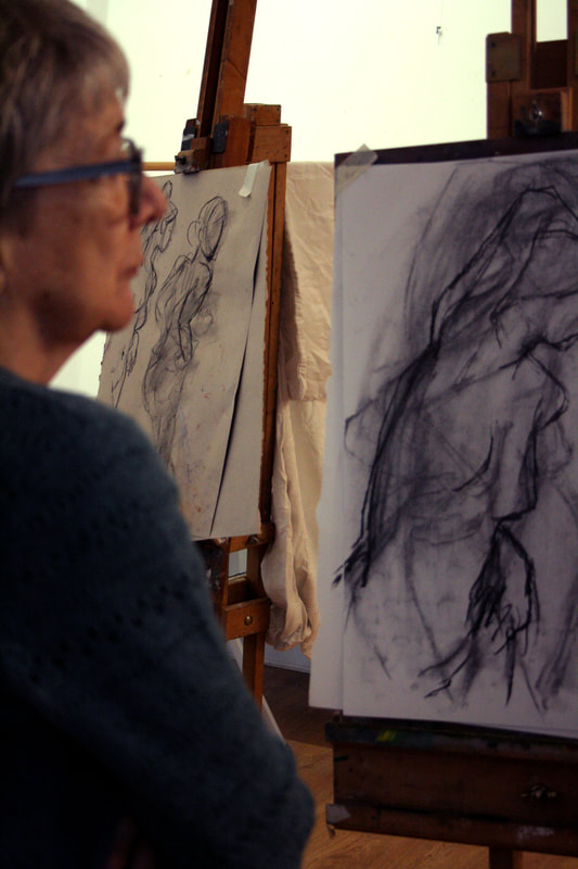
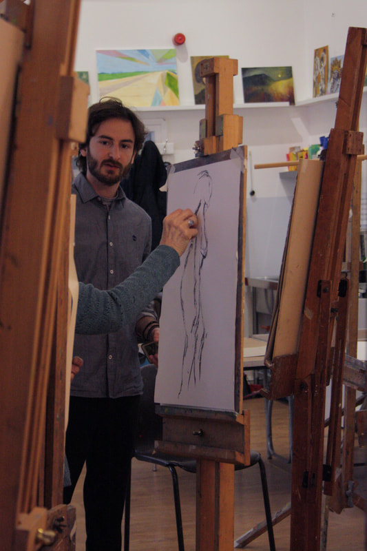
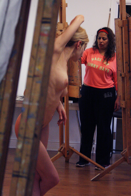
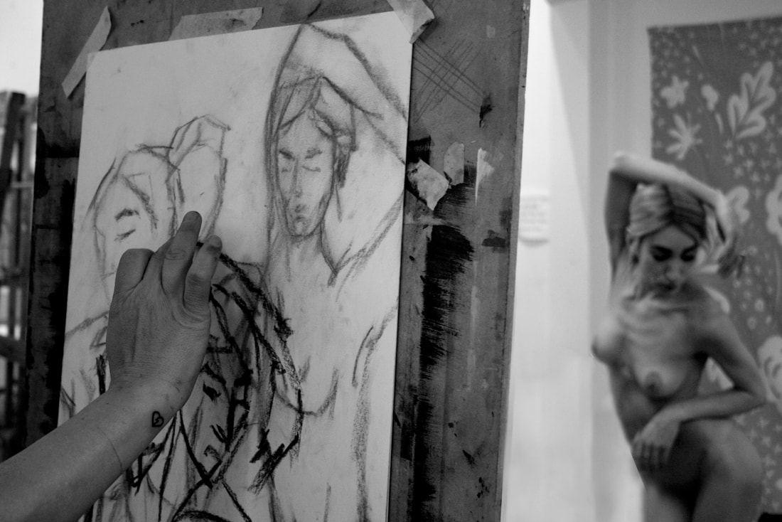
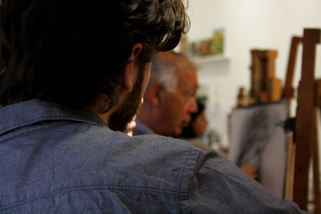
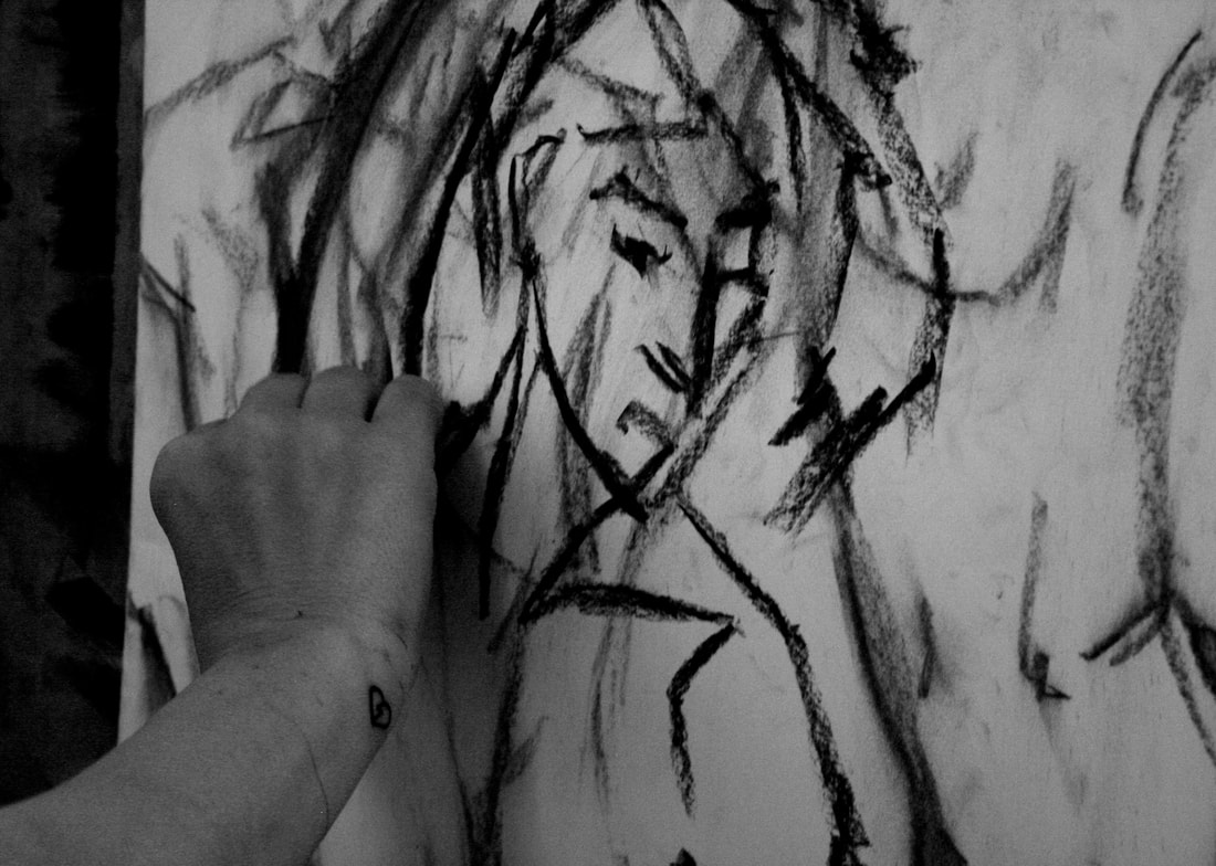
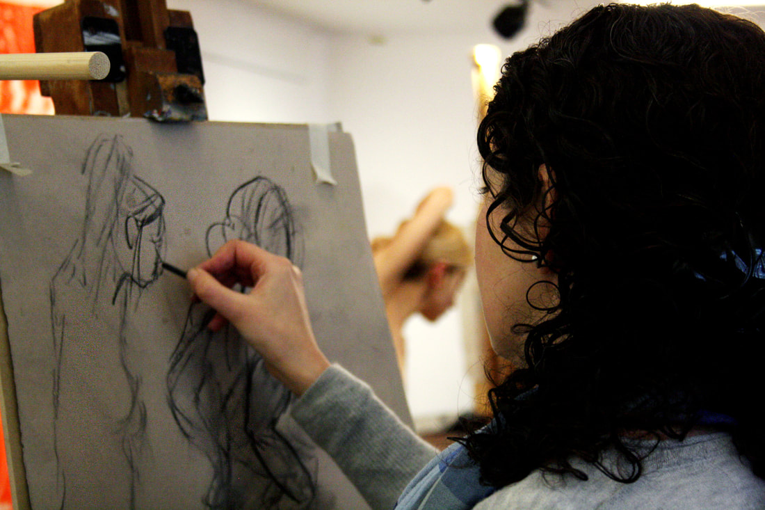
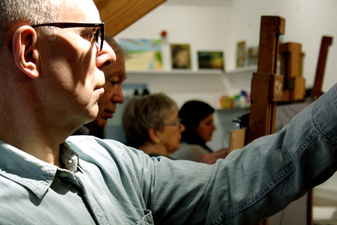
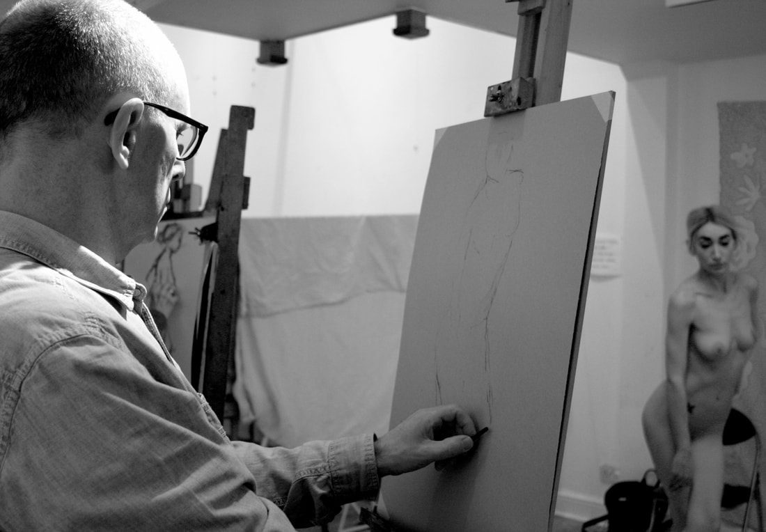
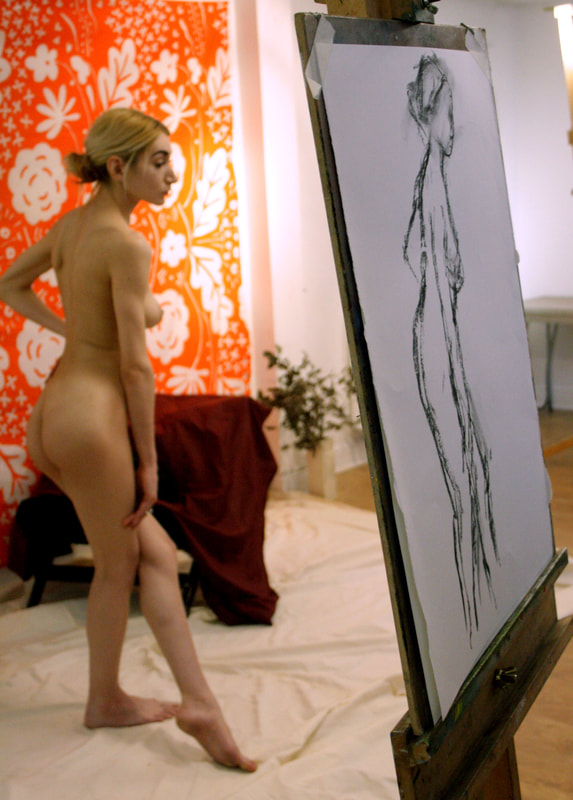
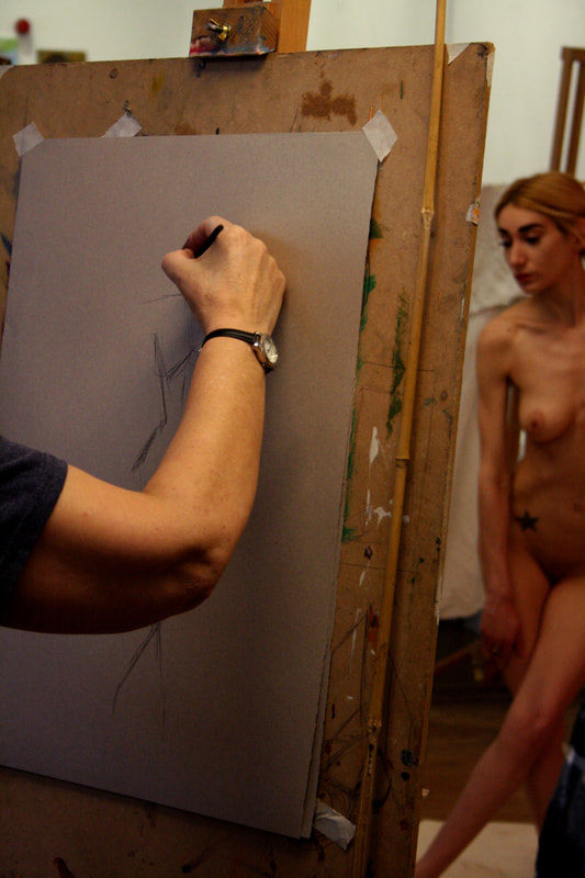
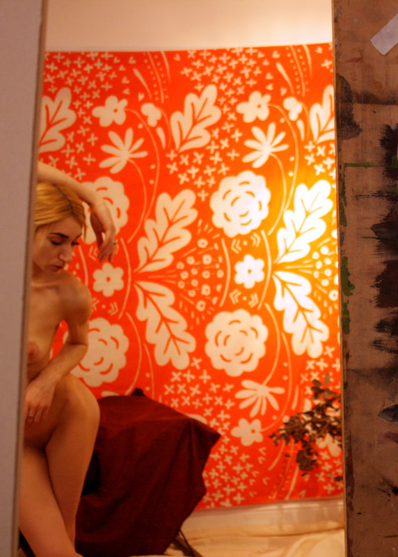
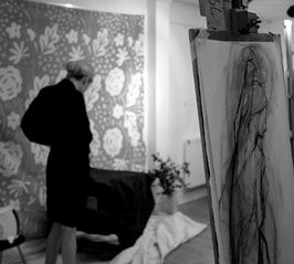
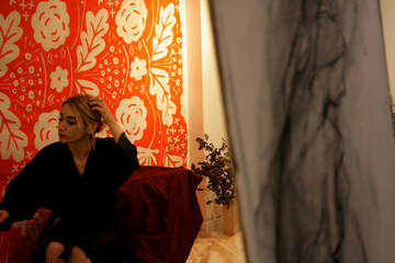
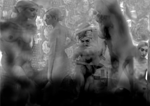
For my first strand I wanted to look into different peoples hobbies and investigating the rich diversity of communities. celebrating all the things we share and have in common and also the different variations of people that share similar interests. I initiated this by Taking photographs at the local tennis club and also attending the Art Class that my Mum goes to on a weekly basis and photographing the environment and the different people that take part. The class that I went to happened to be a life drawing class by which the approximately 10 members of the group drew a naked woman modelling different poses with chalk. I discovered that most people in both of the classes were older with know one below the age of 40. hard to get photograph of everyone together as they were spread out.
When taking photographs at the tennis club It was a very bright day so I successfully managed my ISO by setting it to a lower level in order for the photos not to be overly bright. I also prioritised my stutter speed to be able to capture movement of the tennis games. I also adjusted my aperture accordingly to manipulate the depth of field so the background wasn't overly blurry. However, it would have been beneficial to get some shots of the group together to get a deeper sense of what type of people attend the club and further look at the similarities and variations between the members. Overall I think the images capture the amateur local tennis club and it's attendees.
When taking photographs at the tennis club It was a very bright day so I successfully managed my ISO by setting it to a lower level in order for the photos not to be overly bright. I also prioritised my stutter speed to be able to capture movement of the tennis games. I also adjusted my aperture accordingly to manipulate the depth of field so the background wasn't overly blurry. However, it would have been beneficial to get some shots of the group together to get a deeper sense of what type of people attend the club and further look at the similarities and variations between the members. Overall I think the images capture the amateur local tennis club and it's attendees.
Tennis club:
|
|
|
|
|
|
|
|
|
|
|
|
|
|
|
|
|
Art class:
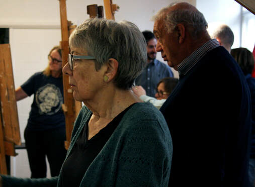
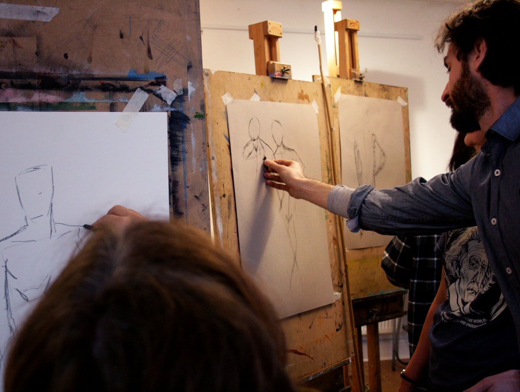
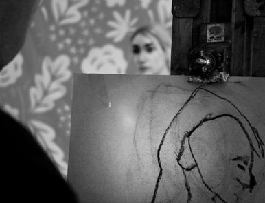
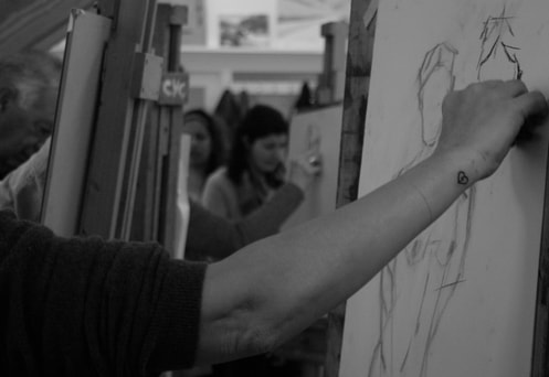
When taking photographs at the art class it was a fairly low lighting therefore I set my ISO to a high setting in order for them to be bright enough. I also prioritised my depth of field in order to get a focus on the life model in the background as well as the people drawing her and their art work. I think i successfully managed to capture the general atmosphere of the class however, like the tennis club, It would have been good to get a group photographs of everyone that attends the class. Nevertheless the final photographs were successful in documenting links in common interest and therefore linking with the main title 'similarities and variations' due to the similarity in interest but variation regarding the diversity of people who take part.
|
|
|
|
|
|
|
|
|
|
|
|
|
|
|
|
|
|
|
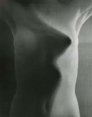
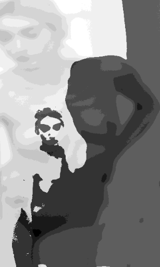
Strand 3: variation of representation and focus
For this development i intend to document the different ways in which something can be represented. I was inspired by the artist Erwin Blumenfeld as inspiration who uses abstract techniques and layers silhouettes and figures together. Blumenfeld is among the most successful photographers of the 20th century, he brought a radical vision to his work in portraiture, nudes, fashion, and advertising, effectively re-defining the potential of his medium. Though he took his first photographs in 1907, it was not until 1941, after arriving in New York to escape Nazi persecution, that his career took off and many of his works have a subject matter related to Nazi Germany. I admire his use of abstract and out of focus figures in his photography and am interested in representation of the human body.
Erwin Blumenfeld:
|
|
|
My Edits:
|
|
|
|
|
|
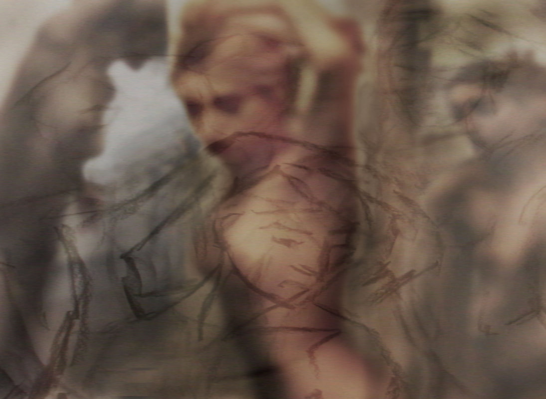
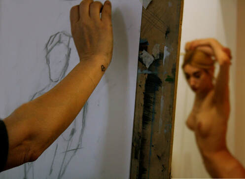
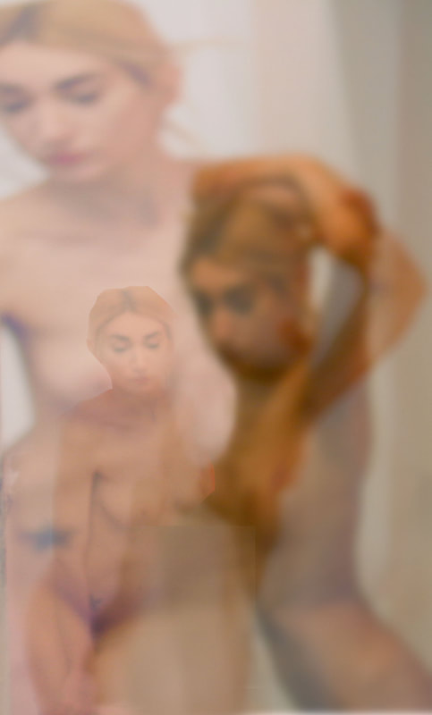
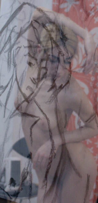
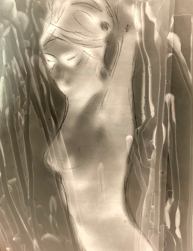
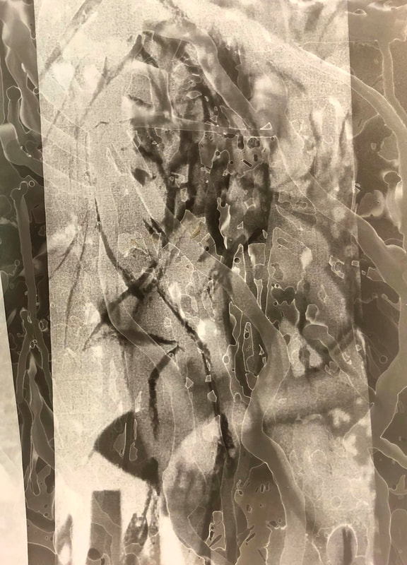
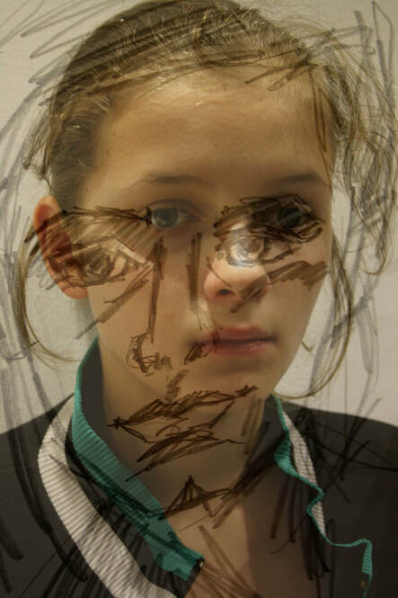
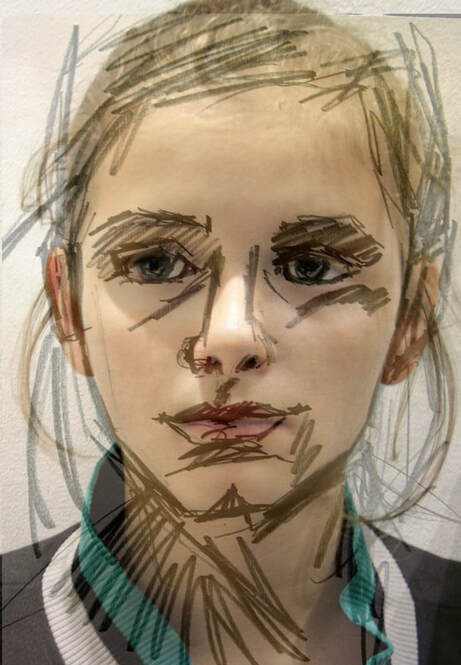
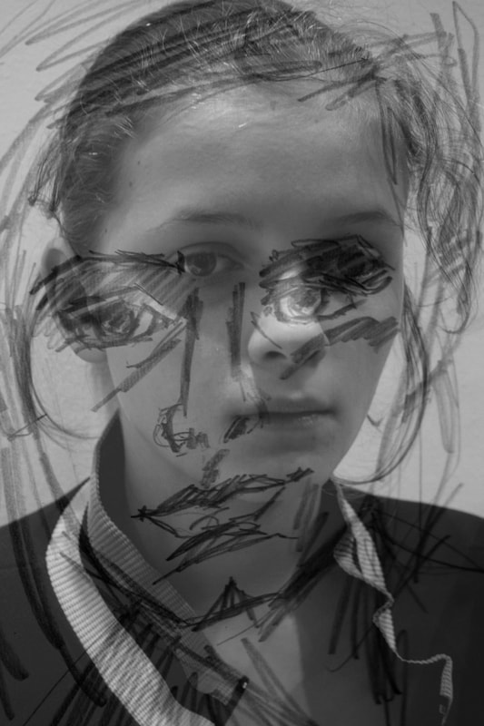
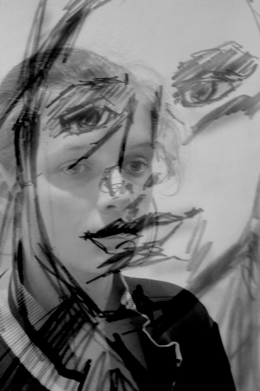
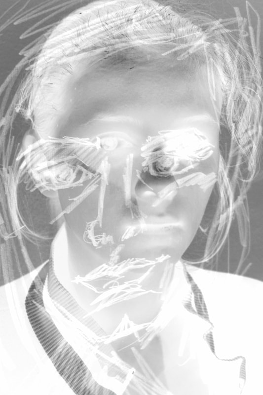
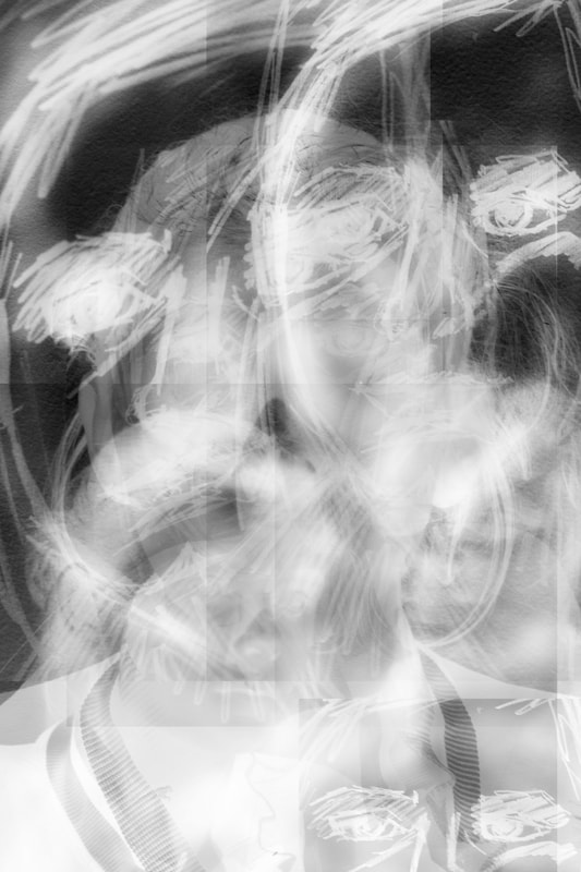
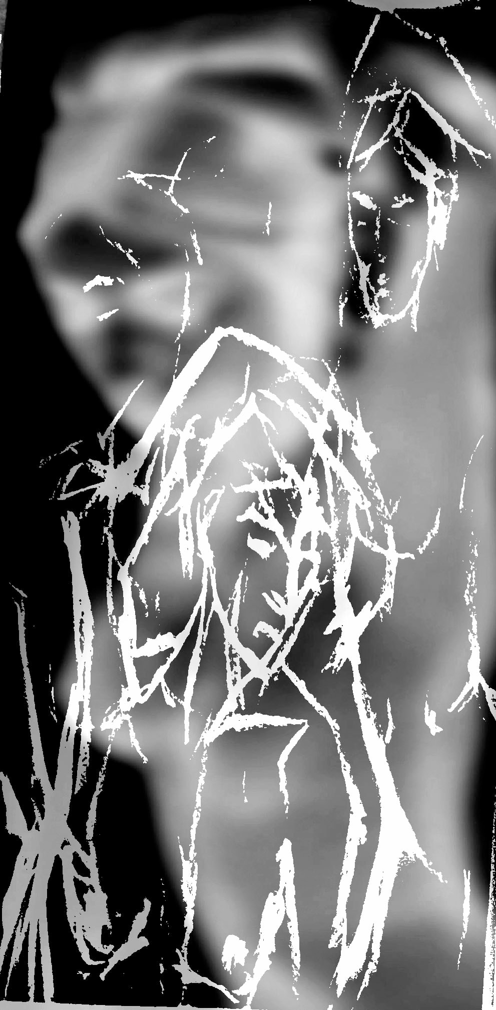
I attempted to capture different representations of the female figure photographically by layering the photos of the model from the art class I attended on top of the drawings of the model that people drew. I was looking into blurring the lines and merging the two representations of the model together. I did this on photoshop by layering the drawing on top of the photos of the model and then lowering the opacity of one of the layers to create a merging of a 2D form of the drawing and the 3D photograph. I also took lots of images of the model and layered them together creating lots of silhouettes in one image and fusing them together. However, some of the edits you could see the lines where I layered other photos on top which made them less effective. Furthermore I came to the conclusion that the final images that were most successful were the drawings integrated with the original subject. Therefore I'm going to develop this strand further by combining drawing from life and the photograph of the subject.
development 1
The strand that I chose to develop is variation of representation. I thought that this strand linked well to the project title 'variations and similarities' as i'm looking at the different ways in which something can be represented. After concluding that the sketches layered on the photo were the most successful I decided to create more images like this.
The artist Emily Granader was an initial inspiration to help the development of this strand. She layers drawings and photographs to create her abstract and pensive images. She takes a photograph of a drawn portrait which is double exposed with a photo of the model. and developer is painted onto photo paper while making the print.
|
|
|
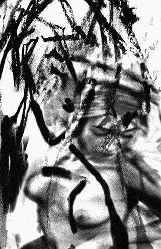
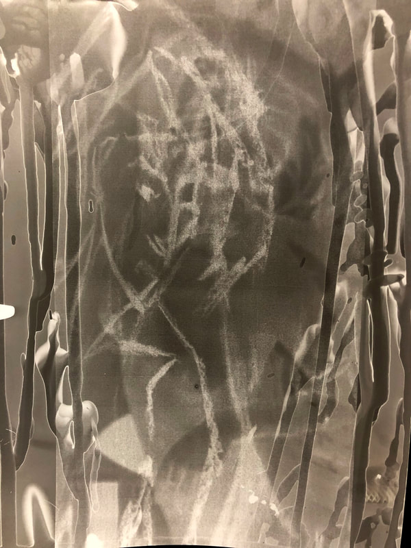
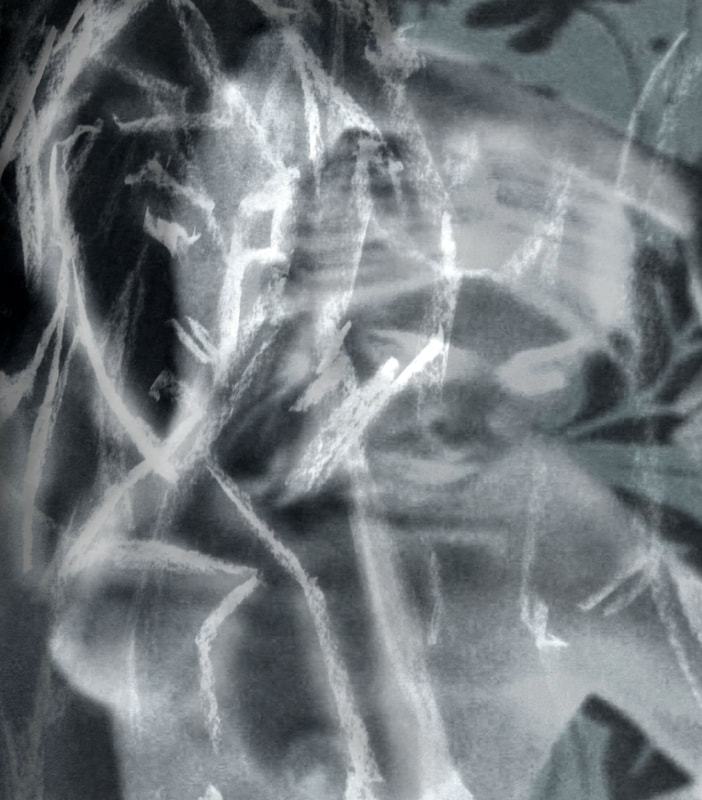
When firstly beginning to develop this strand I wanted to try and replicate the work of Emily Granader. Therefore I printed some of the pictures from the art class onto acetate and developed some prints in the dark room. However, rather than leaving the print in the developer for 2 minutes, I dribbled it on with a paintbrush to experiment in the style of Emily Granader. I then put them through the steps (stop and fix) as normal to create abstract images. Some were too abstract that you couldn't see the woman's figure anymore, these were less successful then the ones with a clear outline of the women in the original image. I like this technique and thought it was an interesting twist on just developing the prints normally. However, I thought that it looked too hectic with the layered images therefore when continuing to develop this strand i'm not going to dribble developer on in this style.
|
|
|
|
|
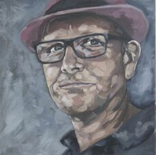
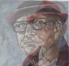
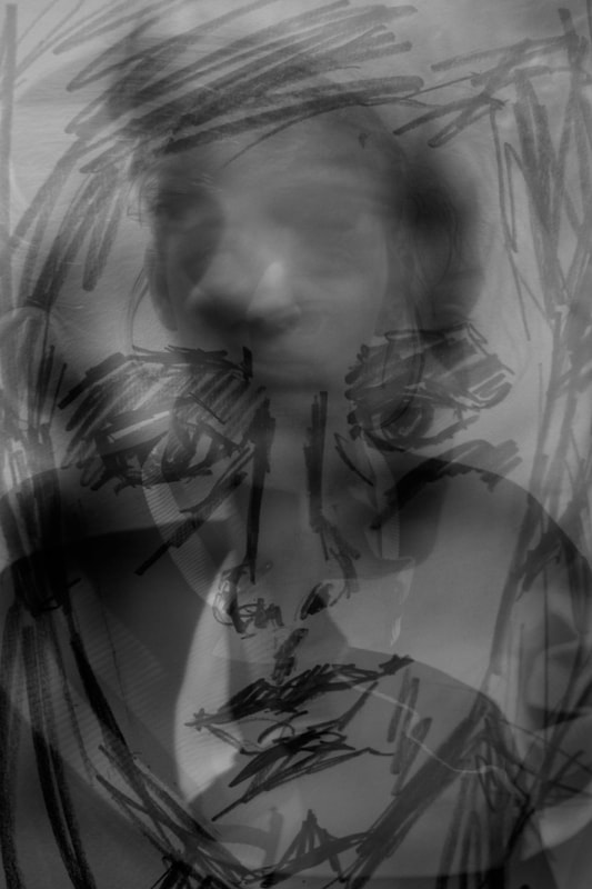
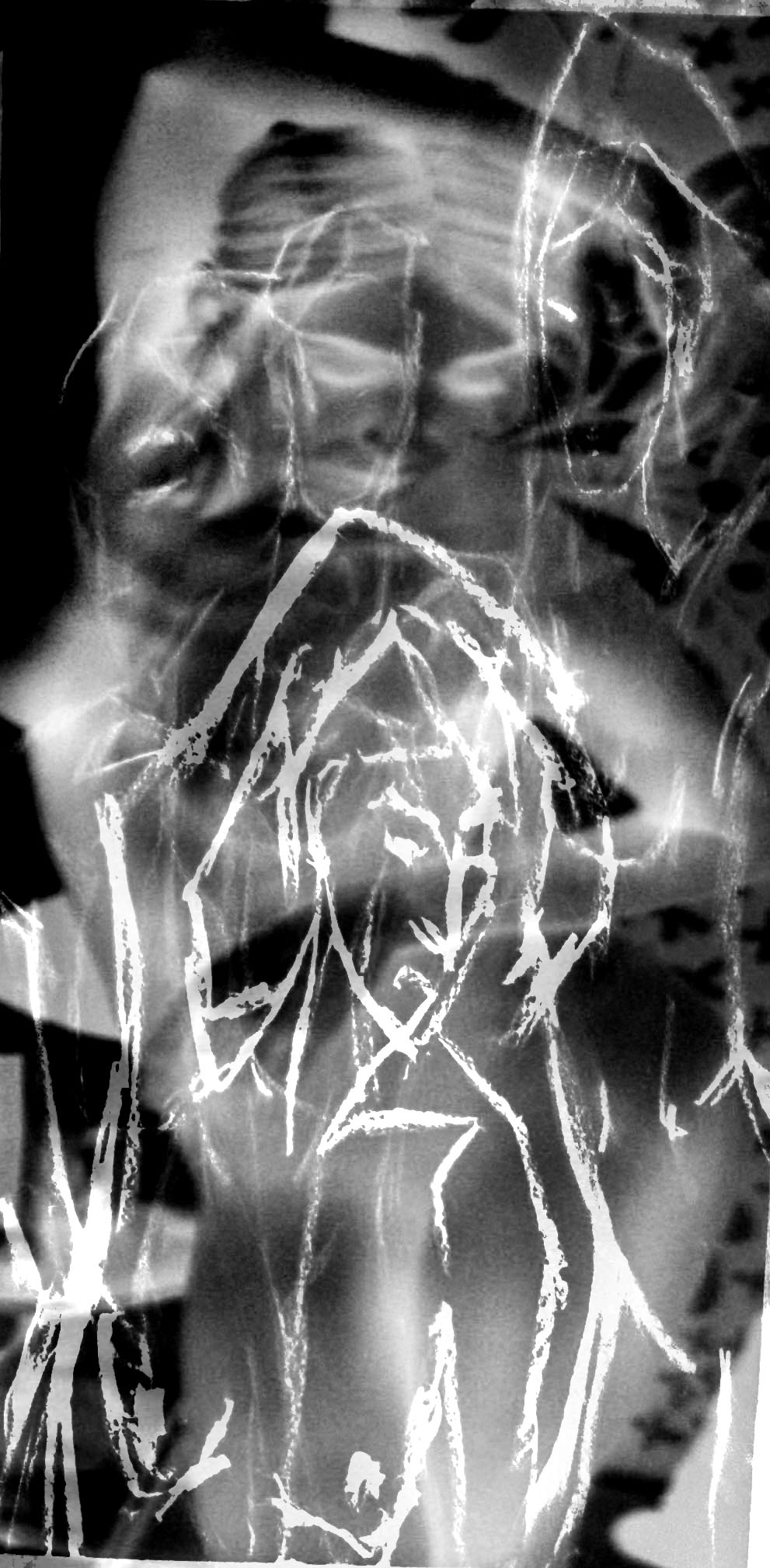
I continued expanding this strand by layering a photo of my Dad onto a portrait that had been painted of him and then adjusted the opacity on photoshop in order for both images to be visible. However, after reflecting on how I want to develop this project I thought that the images would be more interesting and dynamic if I were using rough sketches rather than paintings. I prefer the aesthetic of the images when they have a rough, coarse and more abstract look to them, much like the images that I layered together from the art class I attended. Therefore, when continuing to expand on this idea I am going to build on the style of images that I created from the life drawing class.
|
|
|
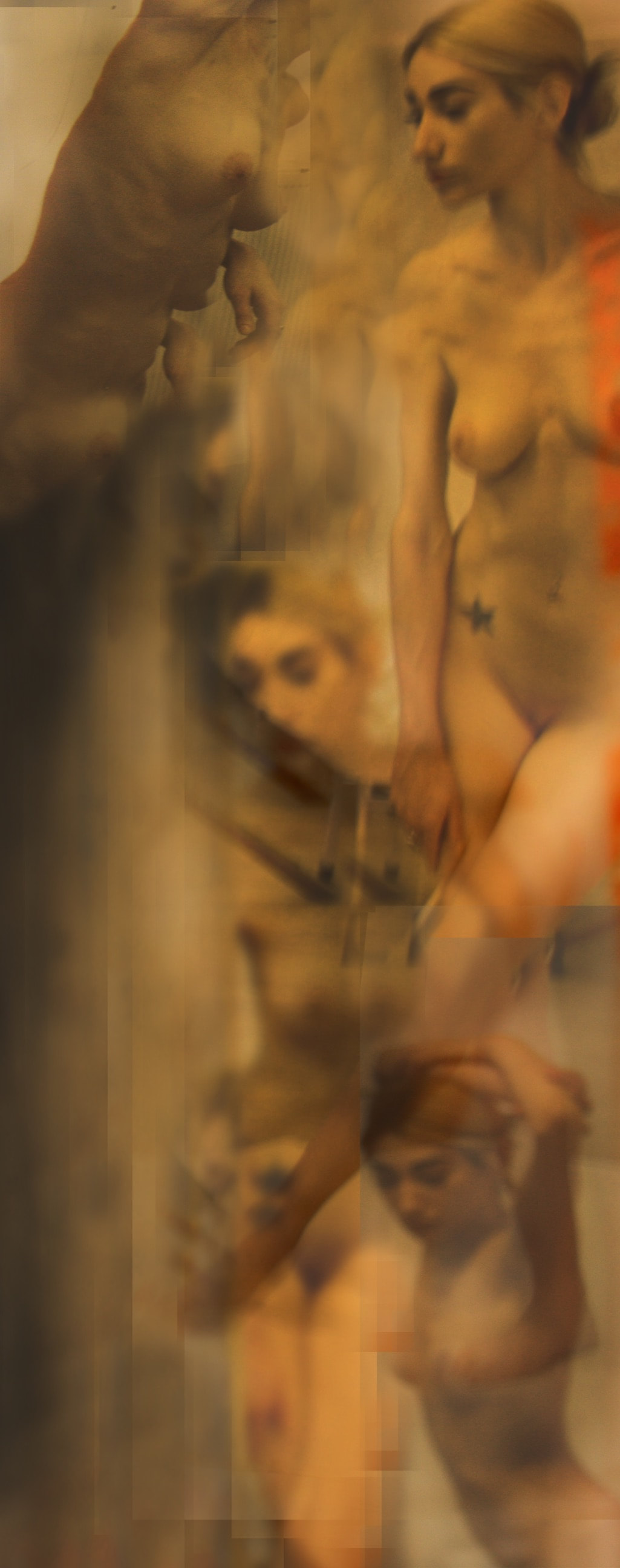
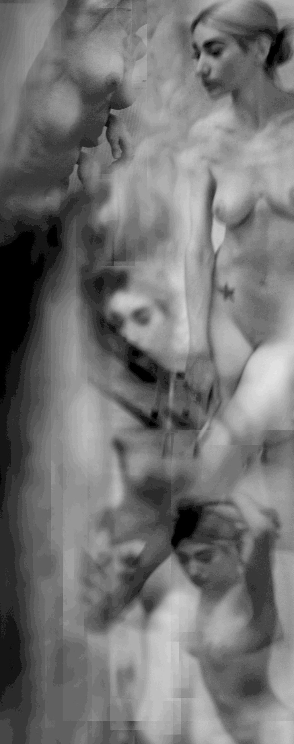
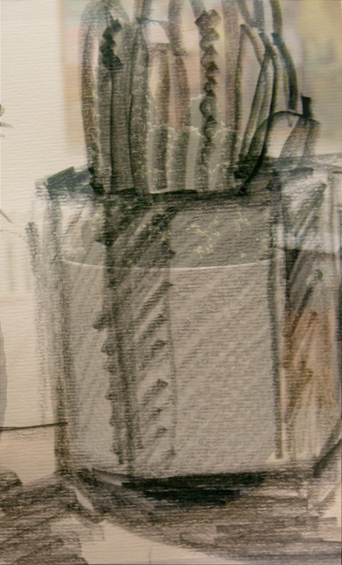
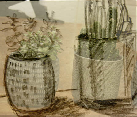
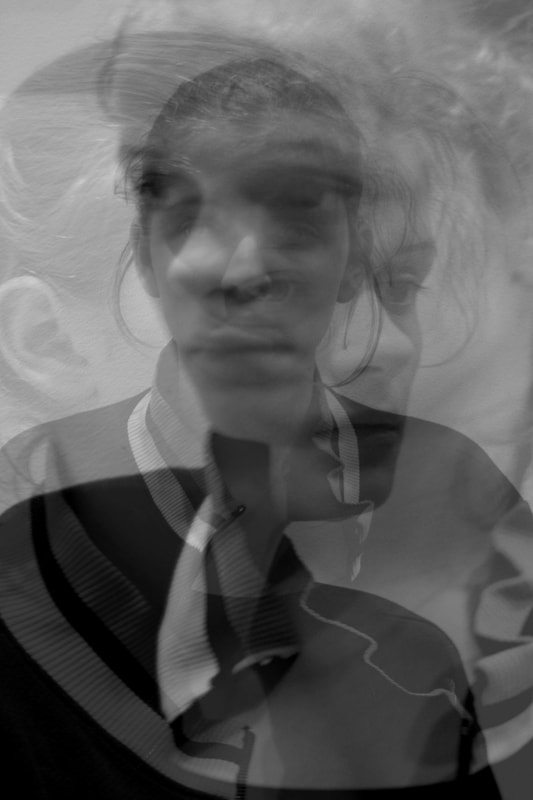
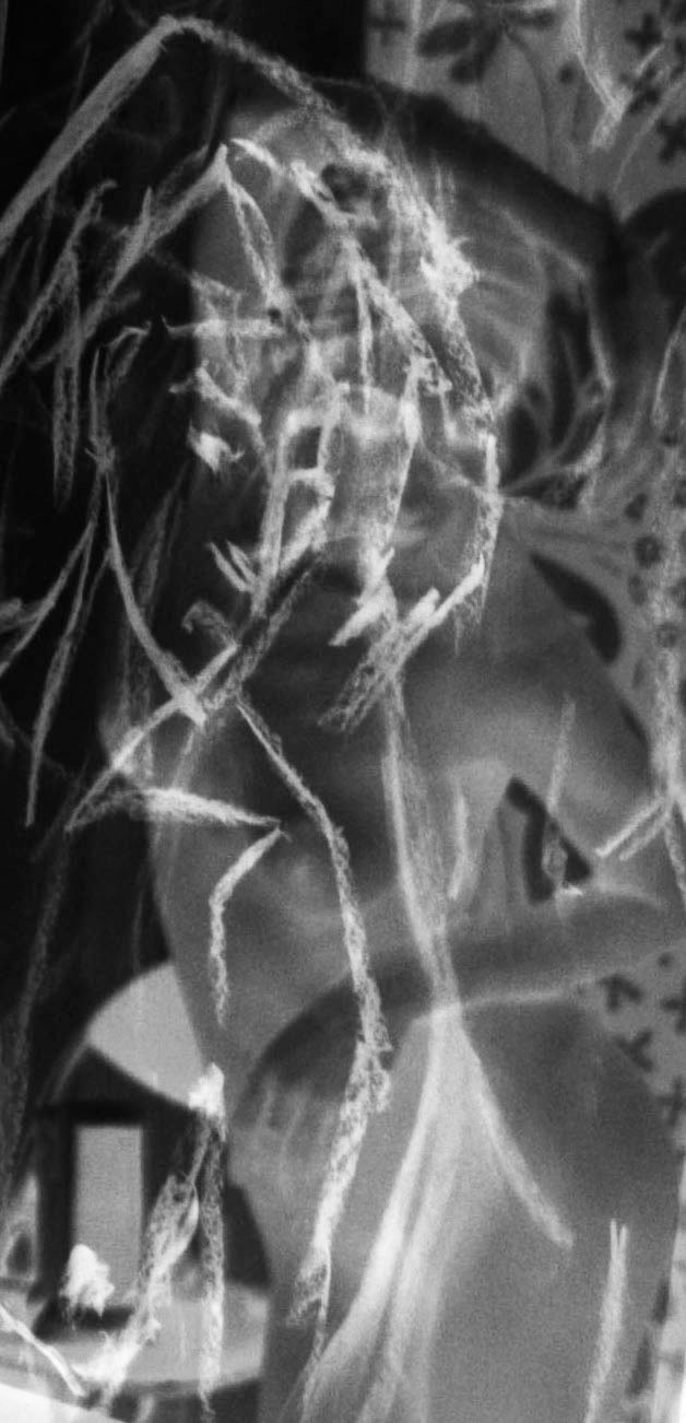
Furthermore, I took photos of my sister whist getting my mum to sketch her. I then took a photo of the sketch and layered them together on photoshop lowering the opacity of one of them to create the layered effect. To get more of a variety I also wanted to take photos of objects and layer sketches on the photos. therefore I took some pictures of plants and got my mum to sketch them. This fitted well with the title as it gave more variation and also explored how people and objects can be represented in a variety of ways. I thought that the more abstract and black and white images were the most interesting and the portrait images that were less literal were the most successful as I thought they had more dynamic and looked more alluring. Therefore when continuing to develop this idea i'm going to use life models and create them in a more abstract style, similar to what Emily Granader creates. However i prefer the look of the images when the drawings are sketches and you canh see the rough lines of the sketch so this is where my work differs from Granader's slick and precise drawings.
Portraits:
|
|
|
|
Objects:
|
|
|
|
Second development:
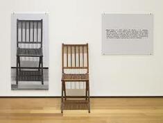
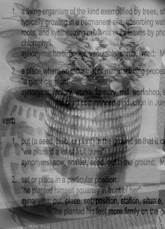
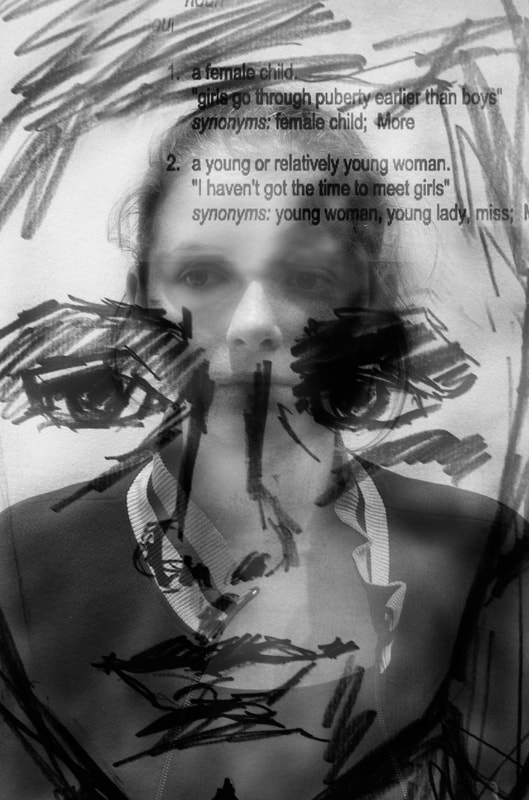
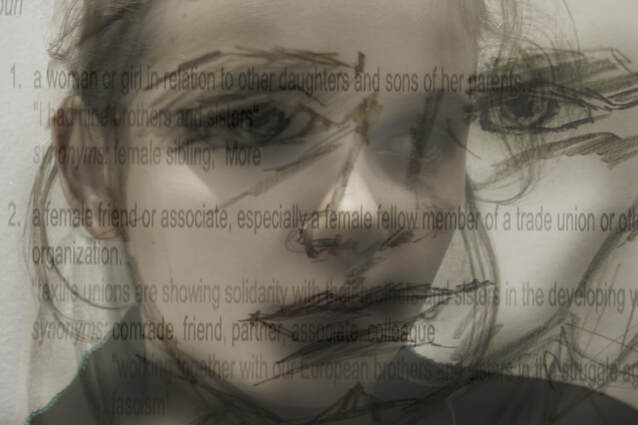
I am going to combine the representation, reality and description of an object / figure in one image. In Joseph Kosuth's One and Three, he asks the viewer to choose the most accurate representation of a chair: the real chair, a photograph of a chair and a dictionary definition. Each representation has reasons why it is and is not the best version however, it is about creating a dialogue about the depiction of the world. I am going to create my own response to this artist by layering a photo of one view of an object/person, a sketch of the same person/object and text describing the characteristics of the person or object. My response to Kosuth's 'One and Three' series is going to differ from his works as I am going to combine people within my representation. I am also going to have the different representation layered together in the image rather than along side each other.
|
1965. Wood folding chair, mounted photograph of a chair, and mounted photographic enlargement of the dictionary definition of "chair"
|
|
|
I think that the images were successful in replicating the one and three idea in my own way. However, i thought that the images with the portraits were more successful than the images representing the plant. I liked the business of the images as it almost gives a sense of confusion to the viewer. When developing further I am going to use photographs of just people rather than objects as i think the outcome is more interesting.
|
|
Third development:
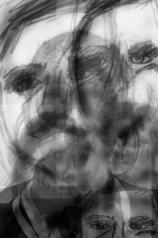
Continuing to develop I wanted to consider representing people from different perspectives and angles to further explore the 'best' way to represent something. I am looking at representation through the medium of art and in my work I am going to combine different representations in one image to try and present a 'truth'. A picture is an illusion of a three dimensional world. Therefore a photograph from one point of view is probably not the best form of representation.
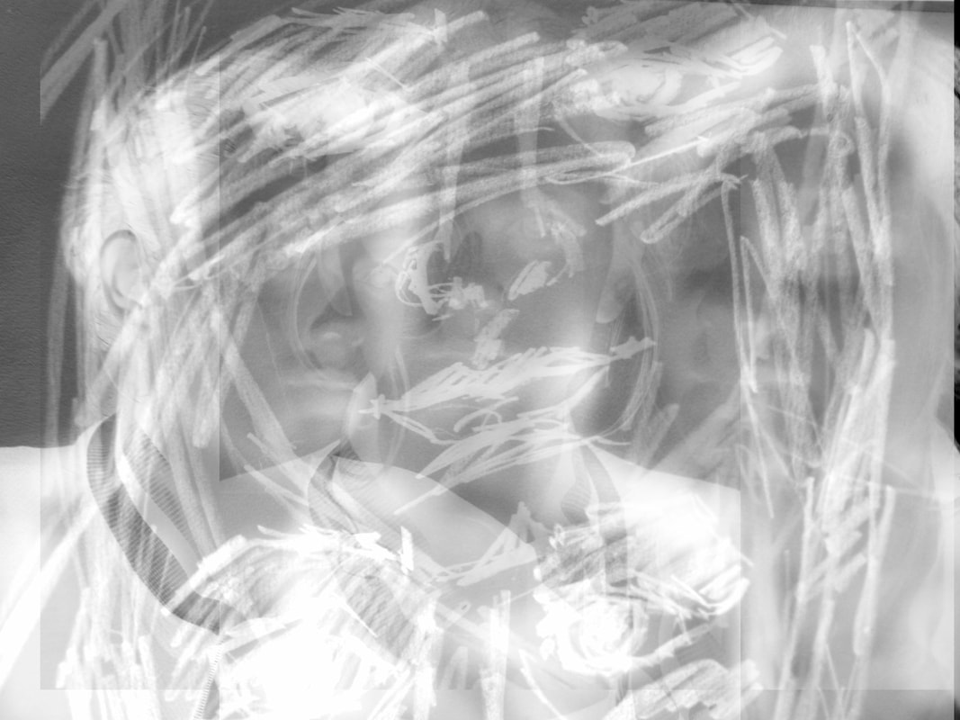
In the images below there are lots of photos from different angles merged together which sketches of the model. I think that giving more angles to the images gives more dynamic. However combining them to the extent where you can't tell what the original stimulus is defeats the original intension of finding the most most accurate way to depict something, despite the images having an interesting and busy effect. I think that finding a balance between my images not being overt but still incorporating an abstract style is my aim for my final piece for this project. Finding this balance and having a clear yet conceptual representation of something is going to be my goal when creating a final piece for this project.
In the images below there are lots of photos from different angles merged together which sketches of the model. I think that giving more angles to the images gives more dynamic. However combining them to the extent where you can't tell what the original stimulus is defeats the original intension of finding the most most accurate way to depict something, despite the images having an interesting and busy effect. I think that finding a balance between my images not being overt but still incorporating an abstract style is my aim for my final piece for this project. Finding this balance and having a clear yet conceptual representation of something is going to be my goal when creating a final piece for this project.
|
|
|
Final piece: process
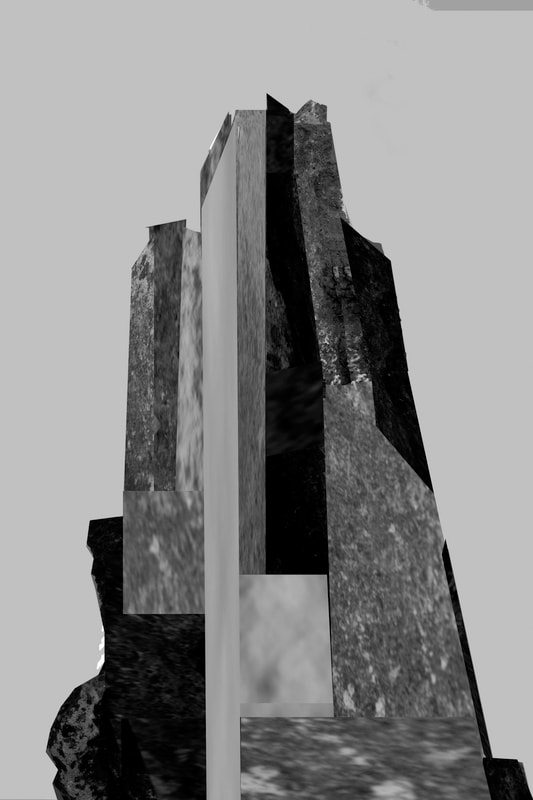
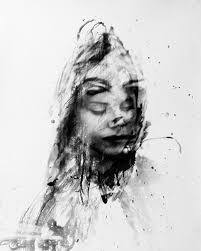
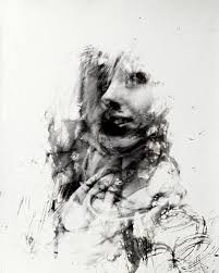
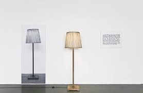
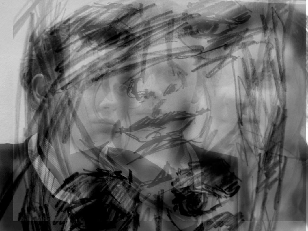
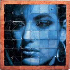
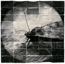
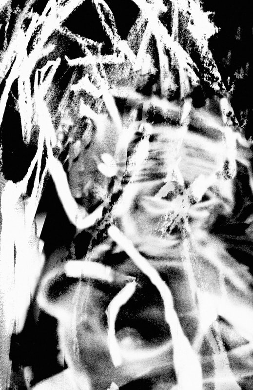
My initial idea when starting this project was looking at people's common interests. However, after attending an art class I was interested by the female figure and knew from the images that I took there that I wanted to involve this in my project. Then after layering her figure onto sketches that people had drawn at the art class I took an interest in the different ways in which something can be represented. This then lead to me investigating the most effective ways to represent something, using the medium of art. For my Final piece I want to create a blown up, abstract image using silhouettes of a woman's figure and sketches. Firstly I need to choose the specific image that I want to have enlarged. I got the inspiration to enlarge the images from the Starn twins who blow up their work into large prints which are made up of smaller parts. Below are two works by the Starn brothers that I took inspiration from. Nevertheless, I want my piece to be abstract and for the viewer to almost have to put the pieces together to identify what it is, without the image being too abstract that it's completely unrecognisable. I thought that it's more interesting to develop lots of small images in the dark room to make one large image rather than simply getting the whole image printed bigger as it has an intriguing puzzle effect which I am going to aim to achieve in my final piece.
|
|
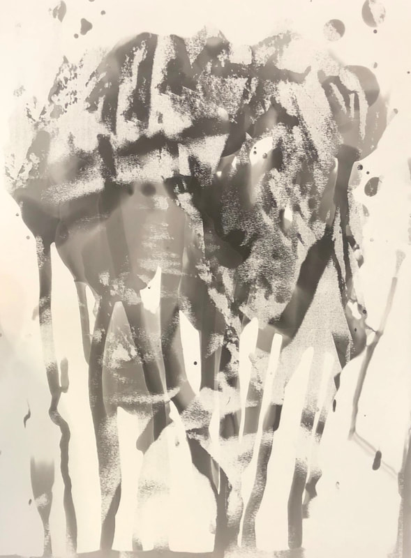
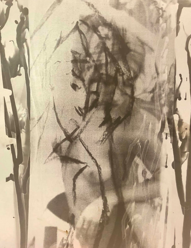
I began by experimenting with the images that I thought were a possibility to blow up larger. I then experimented with them to see what effects or styles I could possibly use. I tried inverting them to see what they would look like, I also tried printing them on different types of paper to see which effects were the most successful. In the end I chose just to develop them on normal photographic paper in the dark room in so that my piece would'y be too busy that it appears overwhelming. As I desired to have my images larger than the enlarger could manage I had to turn it on it's side and project my image up against the wall. I then put one small piece of paper on the wall and did a test strip and came to the conclusion that exposing the image for 8 minutes would give me the best outcome, I also put a filter in the enlarger to increase the contrast. I then lay out all pieces of smaller paper that I needed next to each other to create the large the size I desired. I then put all my prints through the developer, stop and fix before drying them and putting them in the right order.
|
|
|
|
|
|
|
|
